Discovering the renewed facilities of Sancal.
This walk through Sancal’s premises not only reflects the history and evolution of the firm and places it on the map, but also allows you to know how its rural and simple origins have marked its affable and close character. In this Sancal’s exciting Project, there is a lot of commitment and hard work from the Castaño family, as well as a clear vision of future to launch an international firm from a small town like Yecla.
It’s been several years, since Santiago founded Sancal in 1973. For its more than 40 years of existence, the company has had several locations: the first one, a small basement, then a workshop several times expanded in the middle of a rural area and, finally, in 2000 the company moved to the current facilities, which have been extended now.
The first building of the present headquarters, designed by the architecture studio OF, was soon outgrew by the company’s production needs. A second building was acquired to transfer the cutting and sewing processes. However, the expansion of the main nave has once again been essential due to the unstoppable growth of the company.
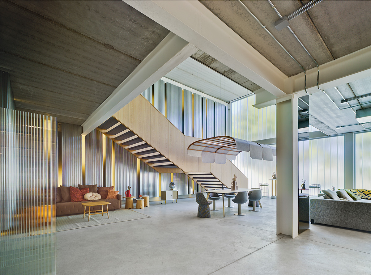
The architecture of both buildings is totally rationalist, since one of the main premises of the expansion project, as a result of the joint work between Cosín and Estudio Sancal, was to find the perfect balance between the old and the new; similar but different as “we wanted to show where we came from“.
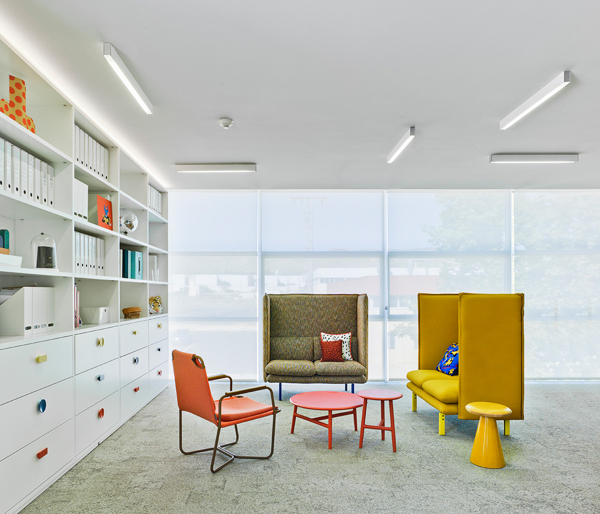
The evolution of the company is completely reflected in the facade of the headquarters: if Sancal were a geometric figure, the brand’s evolution would go from a square to a circle. This is evident not only in the redesign of the logo in 2017 and the latest designs -much more expressive and sinuous-, but also by the introduction of a humanistic vision and a design approach from an artistic perspective.
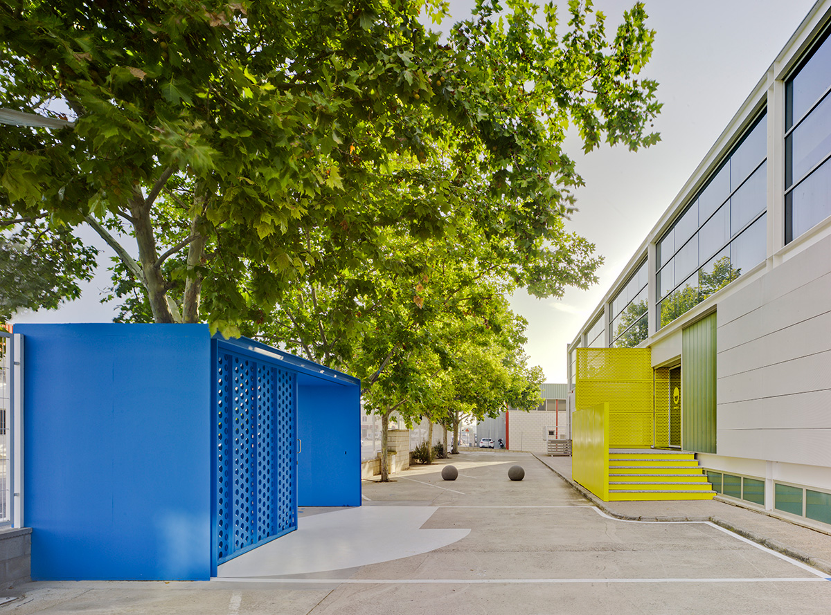
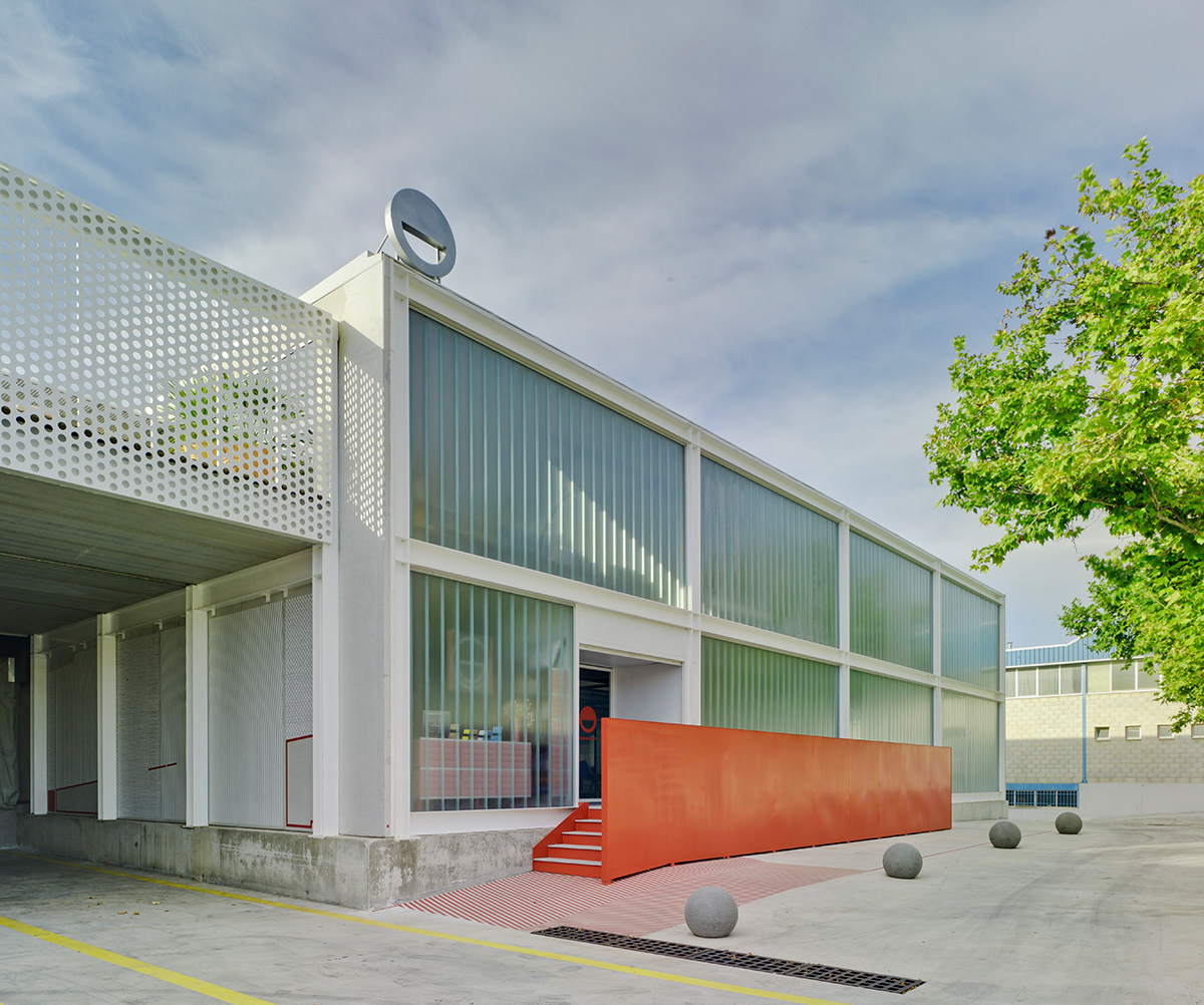
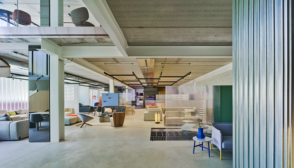
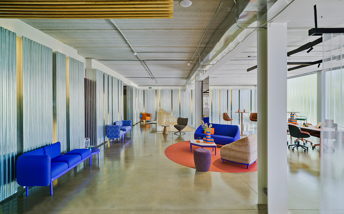
Coming back to the facade, the unequivocal linearity of the two “white boxes” that hosts factory and offices are softened by the presence of metal lattices with circles of different diameters. Timidly present in the original building, now the lattices have been maximized in the new one to add texture and manifest the expressive character of the firm.
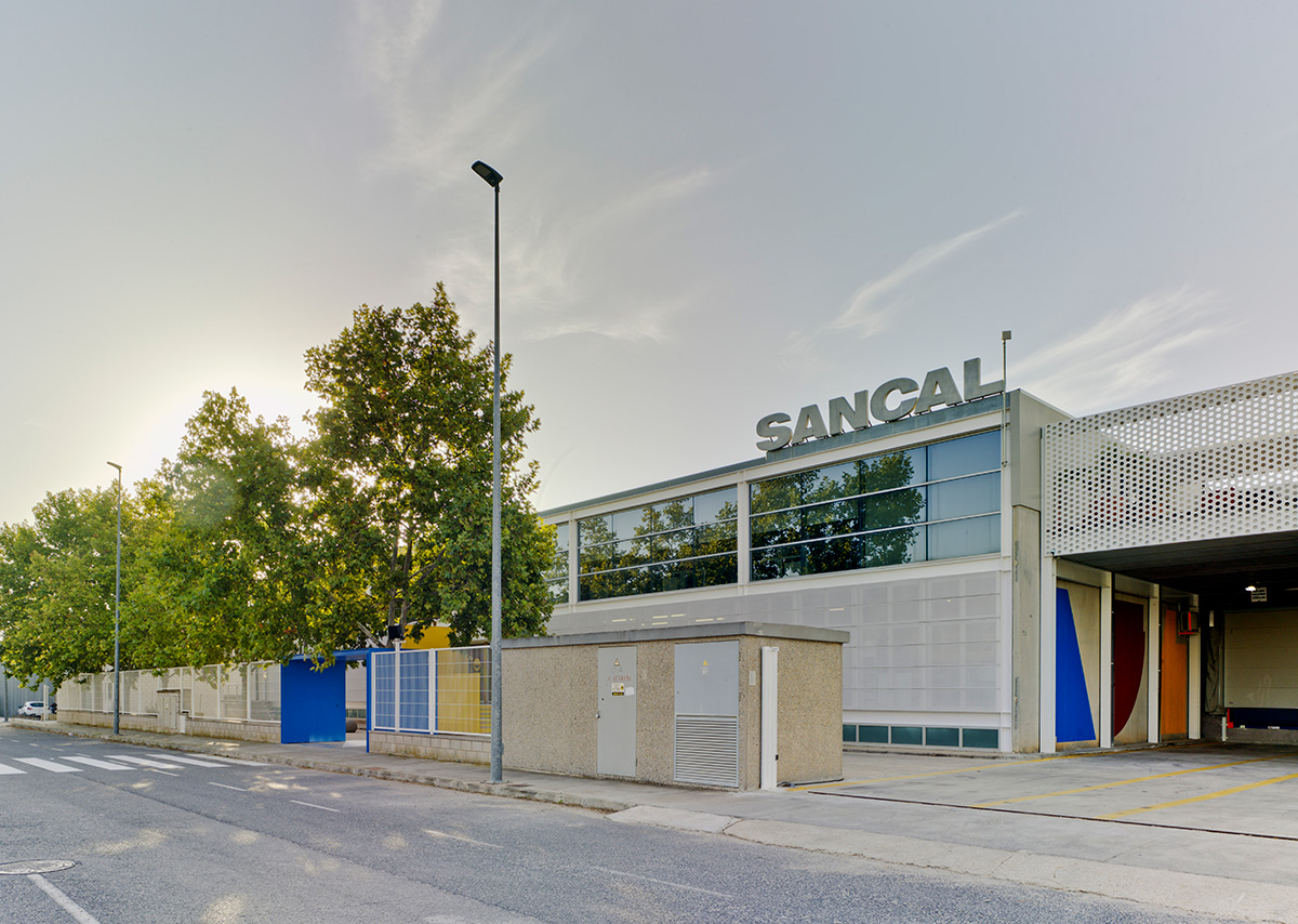
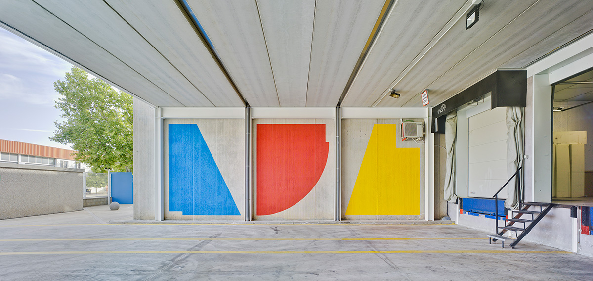
The dominant white in the buildings is splashed by colour, undoubtedly a tribute to the BauHaus, but also a practical way to locate each of the entrances.
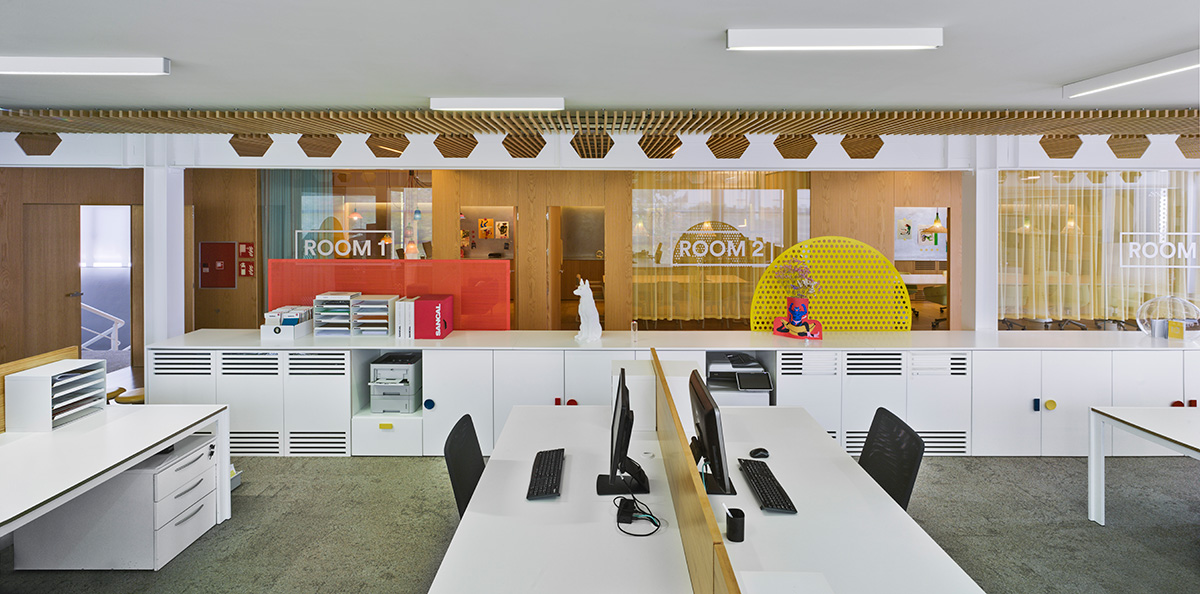
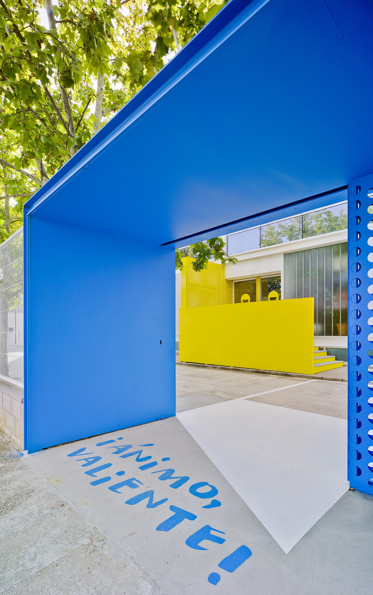
Both buildings are interconnected by the largest lattice, where a delicious terrace hides away over the loading docks. The pedestrian entrance is blue and it helps us to start the visit. Then we find the yellow block that leads to the offices and upholstery sections. On the right, the new building is flanked by a red wall where the showroom is located and behind it, the lacquer, packaging and logistics sections.
But not everything is brick and cement
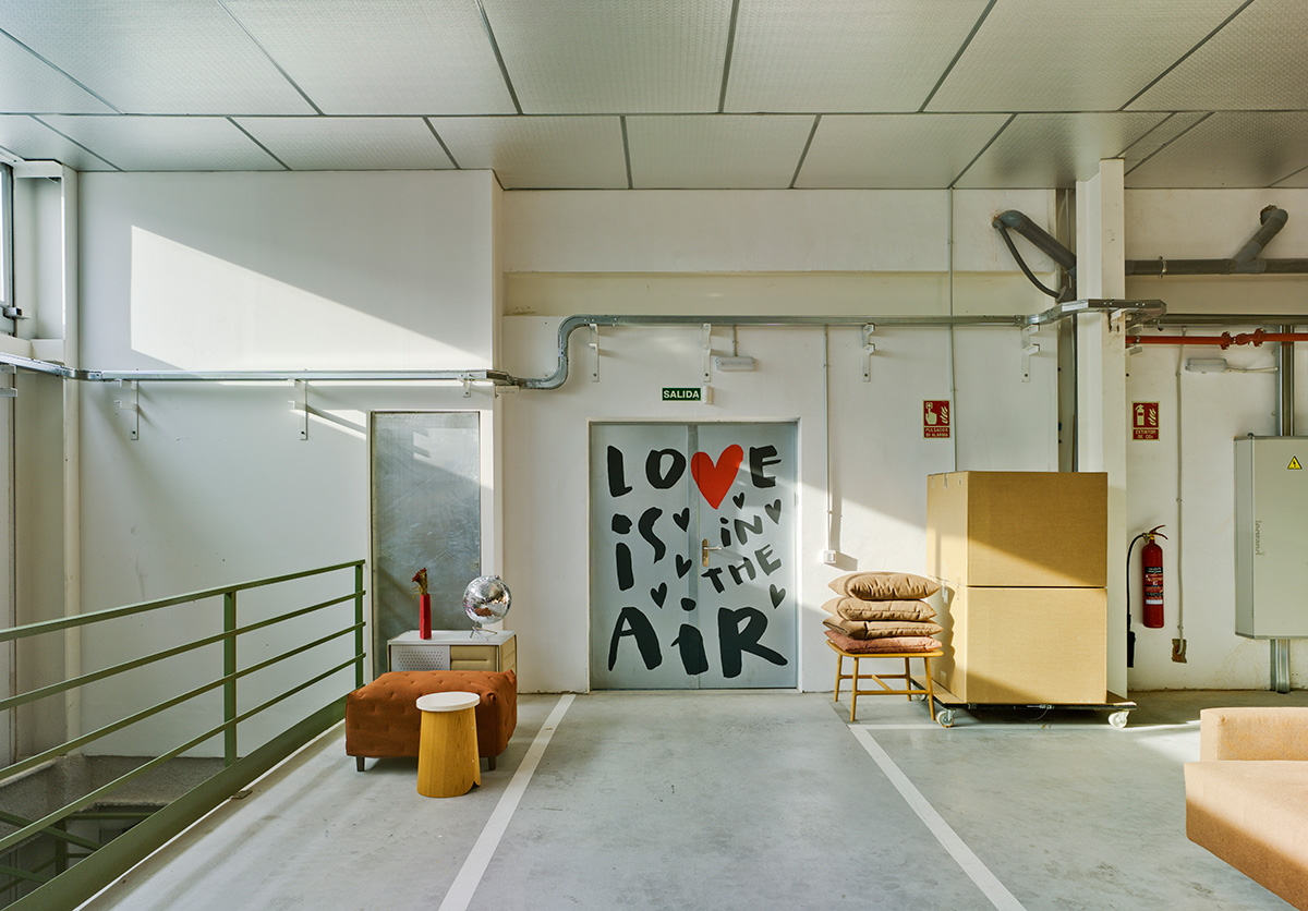
After years of helping other people to create happy places with our designs, in 2013, coinciding with the 40th anniversary of the firm, it was time to project its own happy space. That is why we asked several artists to work in the walls of the production plants. The effect of these “touch-up at 40”1 was so stimulating and inspirational, that there was no doubt to create new murals in the extended facilities.
The result is an inspiring tour that begins in the blue main access where the typographist Marial_Soy created a suggestive floor mural to welcome: “Ánimo valiente” (“Be brave!”).
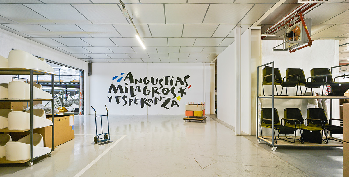
Many other mottos, sometimes fun and other more existentialist, reflect the company’s daily life and accompany all the visitors during the visit to the new production plants. In contrast to the figurative style of the first murals, with Marial_Soy letterings, Sancal wanted to express its comic way of understanding work.
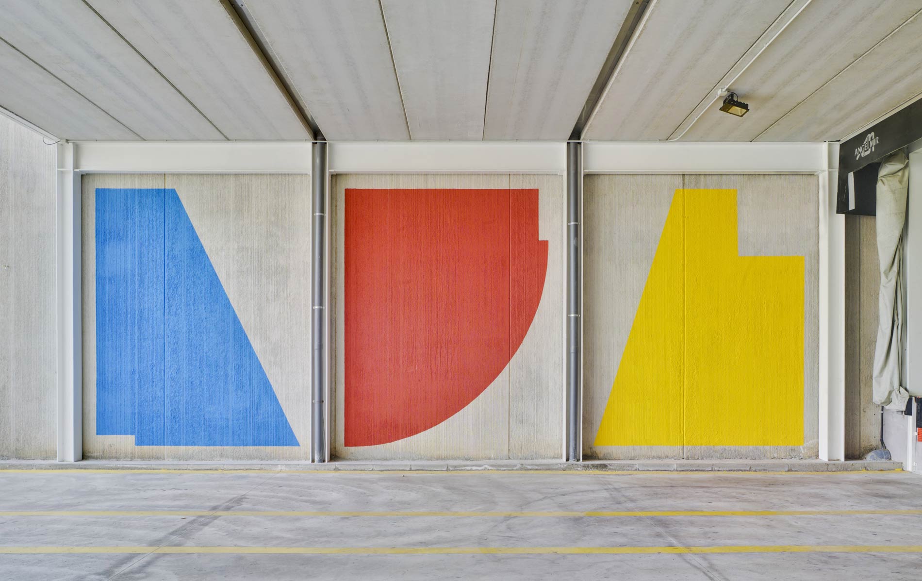
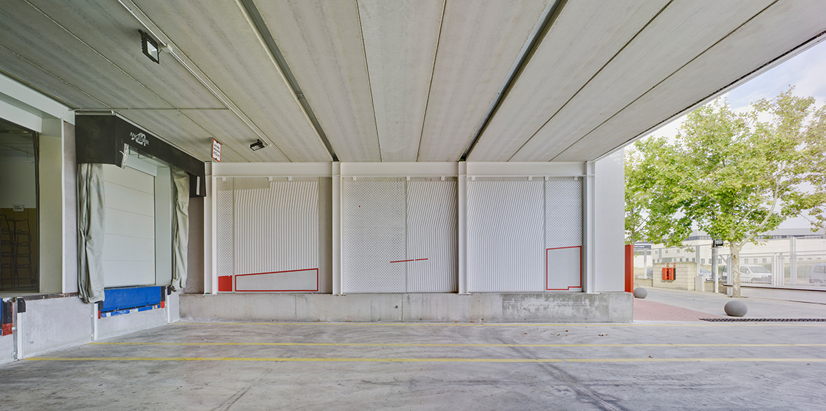
Finally, Seikon has been the urban artist in charge of transforming the loading dock into street art. His graphic patterns take up the circles, lines and colour as central elements in the philosophy of Sancal.
[1] The first three murals were carried out by the artists Agostino Iacurci, Ricardo Cavolo and Zosen, and are part of a greater project called “TOUCH UP AT 40” in which Estudio Sancal was responsible for transforming the halls with a fun signage and included mini-showrooms or “Desing Spots” for the different production sections.