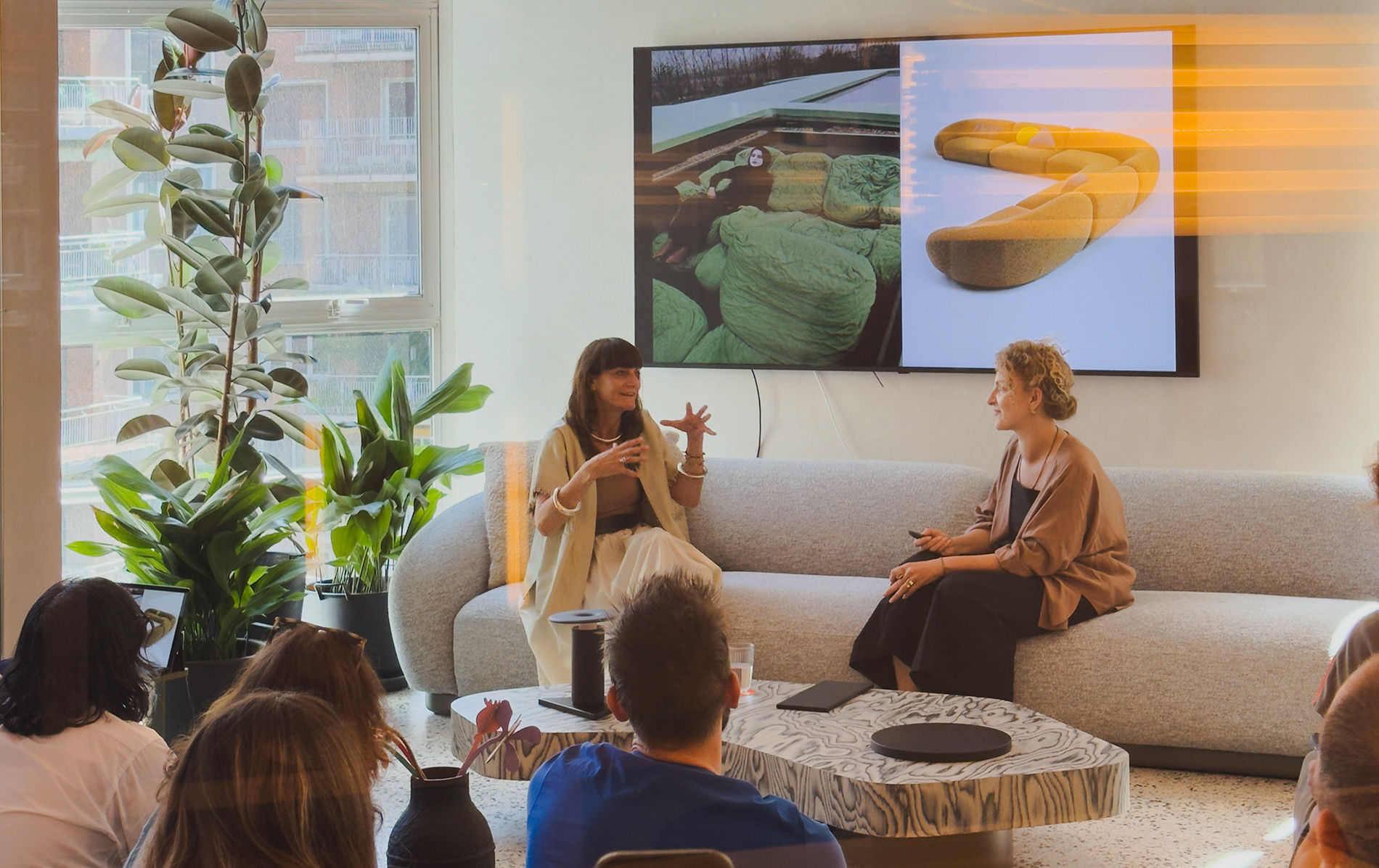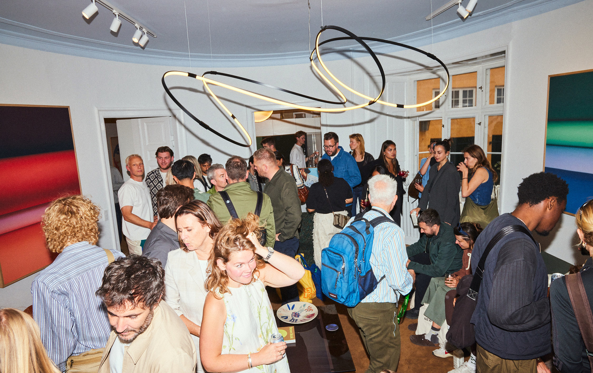

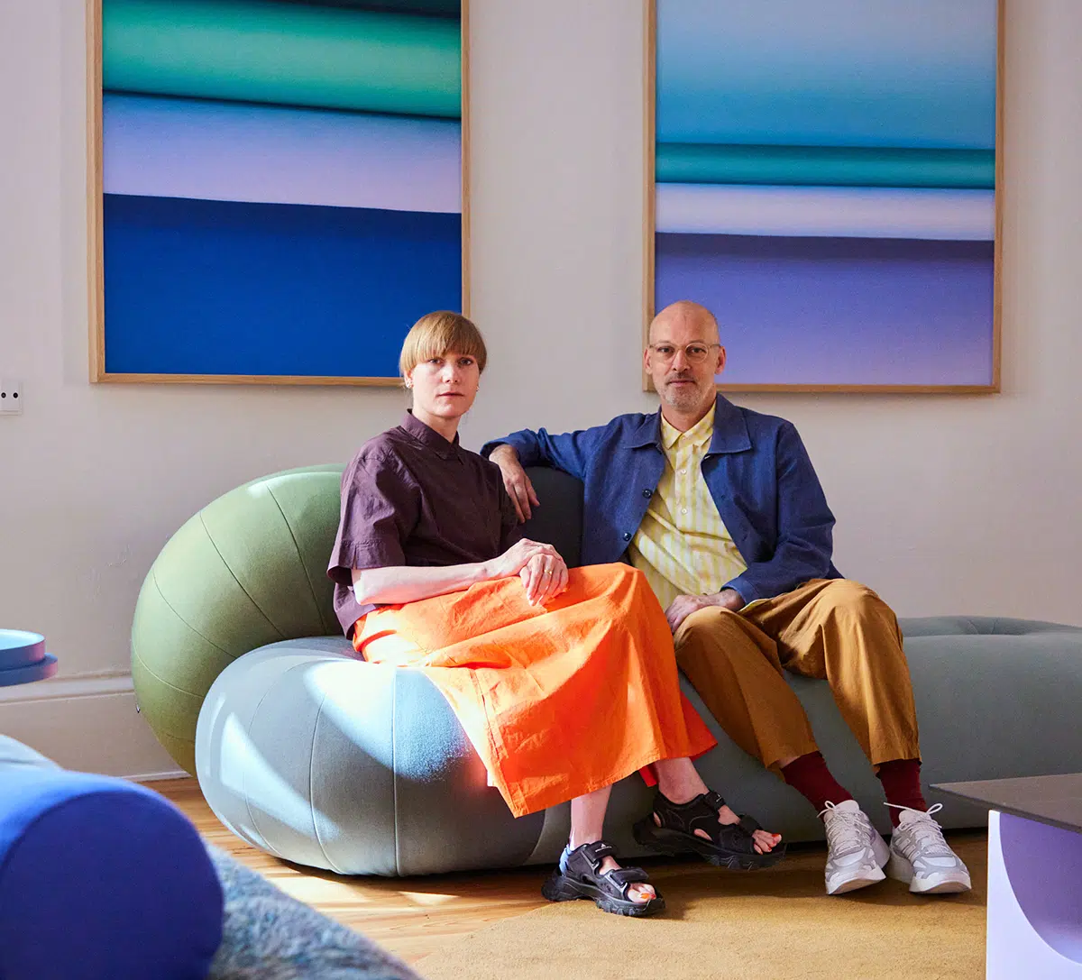
During the latest edition of 3daysofdesign, we had the pleasure of hosting a talk with Daniera ter Haar and Christoph Brach, the creative minds behind Raw Color. From their Eindhoven-based studio, they explore the boundaries of colour through a multidisciplinary practice that merges graphic design, photography, textiles, and product design.
Their approach is rooted in a simple question: What can we do with colour? The answer, it turns out, is endless. “We can set it in motion, give it volume, photograph it…” they explained. For Raw Color, colour is not just visual or emotional. It’s tactile, spatial, temporal. Their installations act as experiments, rehearsal spaces where ideas come to life.
“Colour isn’t only about emotion,” they said. It’s also a matter of preference: do you gravitate towards cool or warm tones? Light or dark? Each colour, they remind us, contains infinite hues, and while colour itself can feel timeless, new combinations are always pushing things forward.
They confessed to some personal favourites: Daniera loves reds, Christoph prefers blues. But beyond theory about Colour Psychology, they also simply follow their hearts.
Nature’s Palette vs Artificial Space
A key part of the conversation centered on the paradox between the natural world and our built environment. “We come from nature,” they pointed out, “and nature doesn’t give us a lot of white or grey… stones are grey, snow is white, clouds too, but everything else is colourful.” In nature, colour always appears in relation to others.
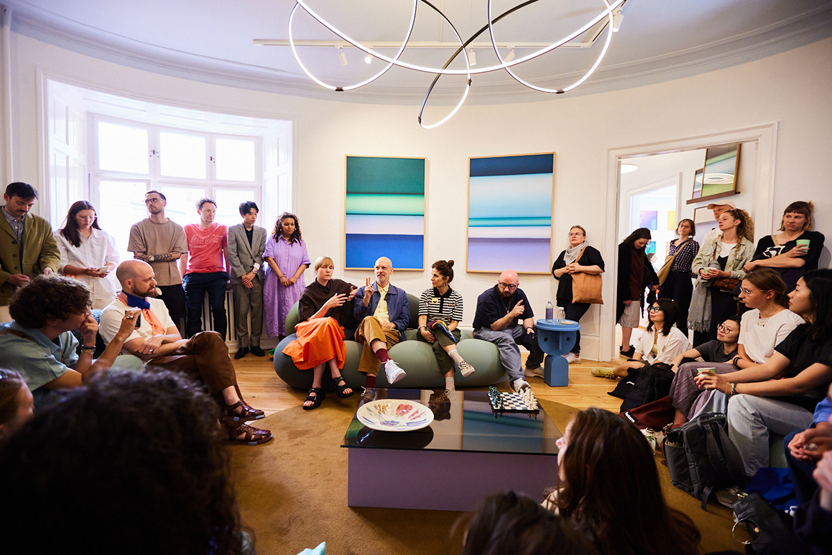
Yet, we tend to design our spaces to be grey or white, filled with synthetic materials and smooth, minimal surfaces. “These places might look calm,” they suggested, “but they can actually makes us more anxious, more stressed.”
Adding colour, texture, and form, embracing complexity, is not just an aesthetic gesture. It’s a way of bringing life and warmth into the spaces we inhabit.
For Raw Color, colour is never just colour; it’s always entwined with texture. Whether on textiles or paper, materials affect how we feel.
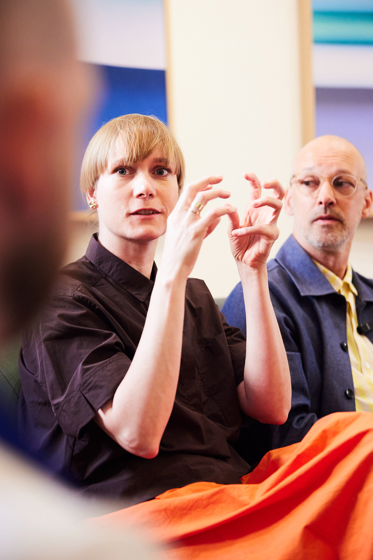
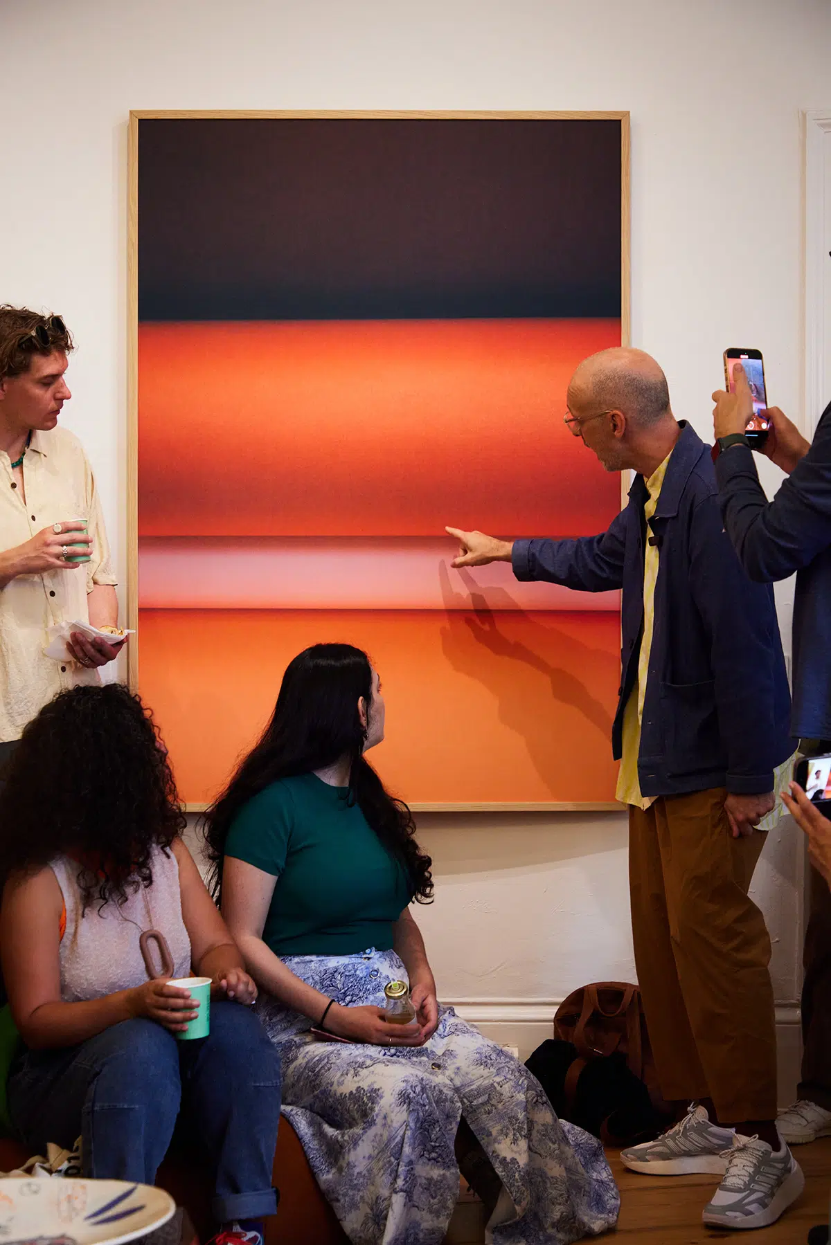
Let the Light In: An Installation with Sancal & Paper Collective .
For the exhibition during 3daysofdesign, Paper Collective and Sancal brought together furniture and graphic art in an immersive installation. More info here.
The setting included their designs for Sancal, the Loop and Link soft seating collections, alongside their Paper Curves series of pictures for Paper Collective.
Loop & Link: Playing with Form and Function
The duo created inflatable prototypes in their studio, large loops they could bend and sit on. The forms felt playful and expressive, but also surprisingly comfortable. They approached Sancal with the idea, and the Spanish brand embraced the challenge.
Covid marked this project. On one hand, Sancal was looking for furniture that would help celebrate being together again. On the other, it was a challenging project in terms of remote collaboration
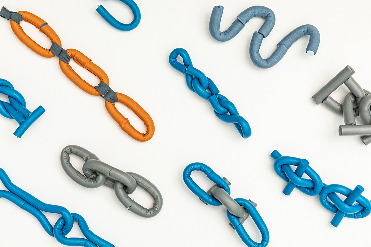
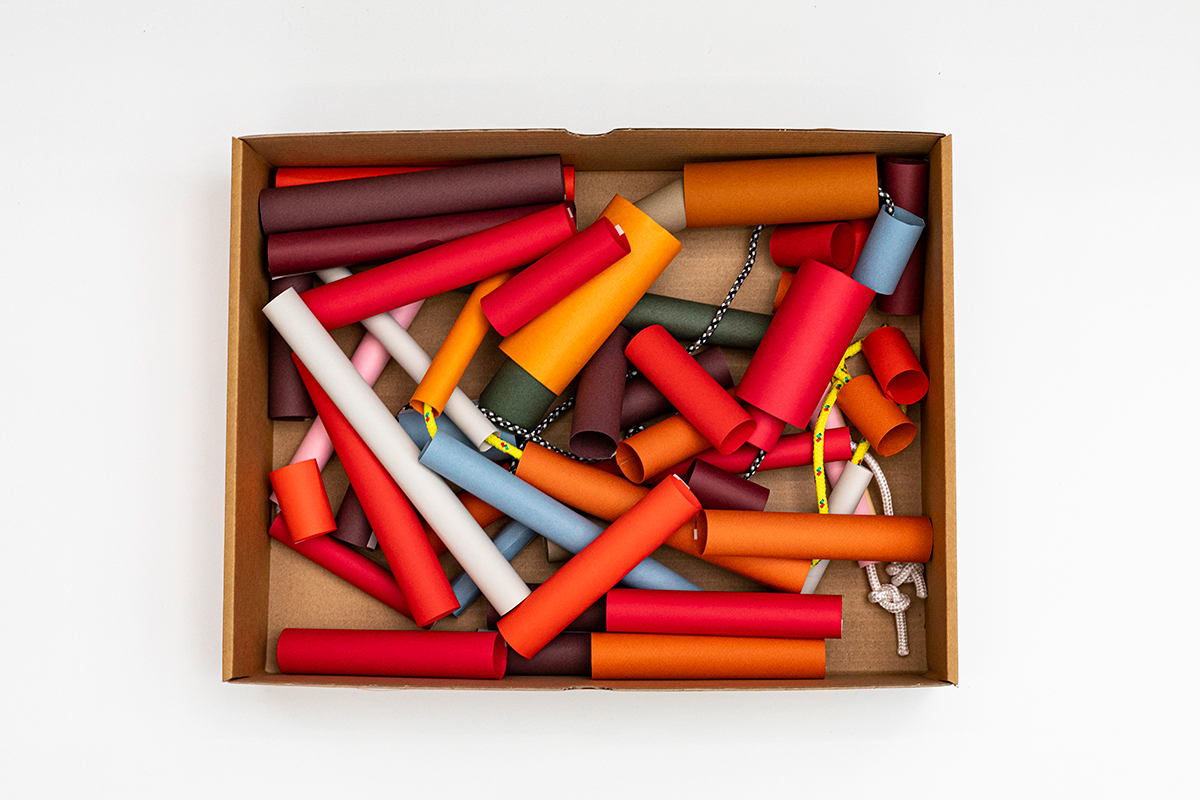
Without being able to travel, Raw Color used foam rollers, sketches, and digital drawings to communicate their vision. Sancal then translated those concepts into prototypes, sharing updates through photos and videos until the final products took shape.
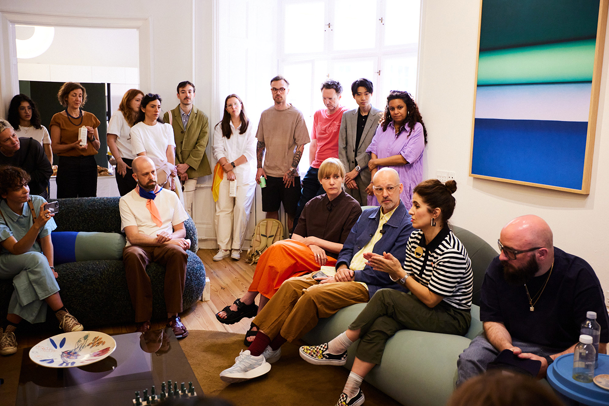
Sancal’s Esther explains, “Loop was tested in a more academic way, as its structure suggested a more conventional sitting posture. Link, however, was completely open. There was no clear way to sit. It was about letting go, embracing an unstructured approach to comfort.”
“We didn’t know how people would embrace it, but it seems people like it!”, adds Daniera.
When the pieces were first shown at Salone del Mobile, some visitors asked themselves if Link was a sculpture or a seat. That ambiguity was part of the appeal: What should I do with it? A question that invites interaction.
Paper Curves: Sculpting with Light.
Raw Color’s Paper Curves series captures another dimension of their process. Sheets of paper are curved and photographed under precise lighting. “When you turn paper,” they explained, “you get a curve, but also the light hits it differently. It creates shadows, gradients, depth.”
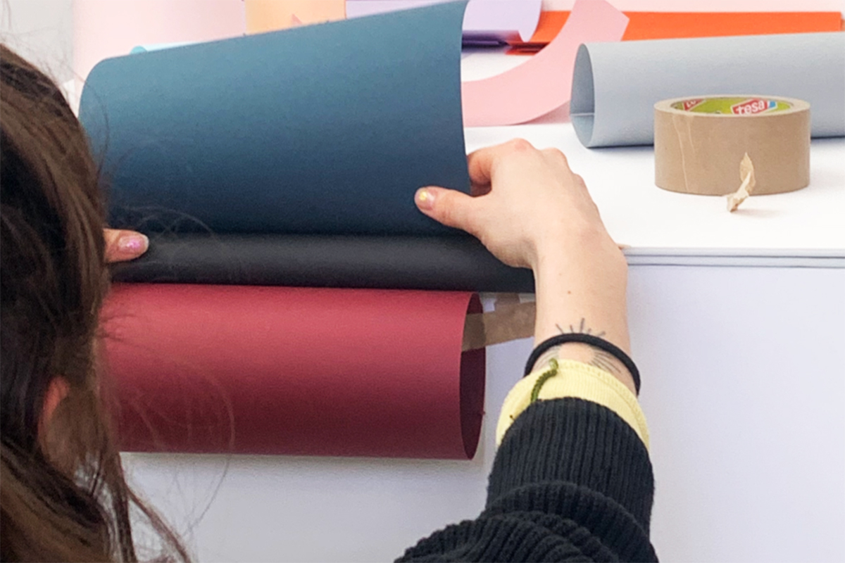
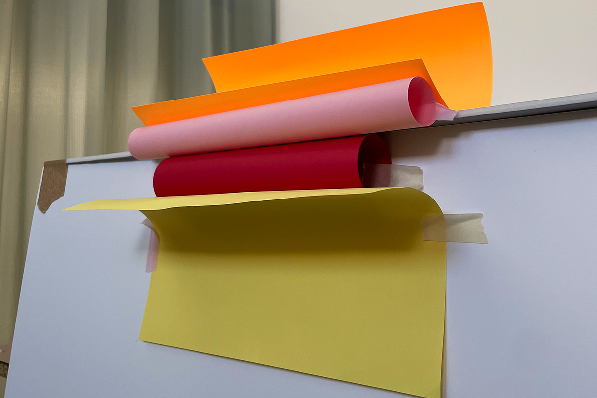
Simplicity is key: “We like simple shapes, clear forms. We always try to be very precise in what we do.” This clarity, however, never limits their work. Instead, it provides the foundation for constant experimentation.


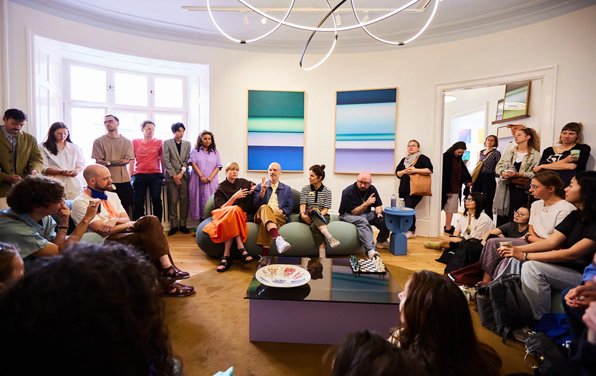
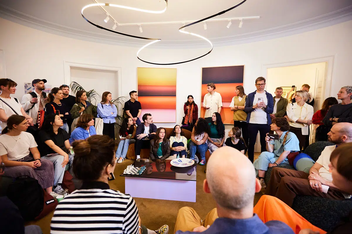

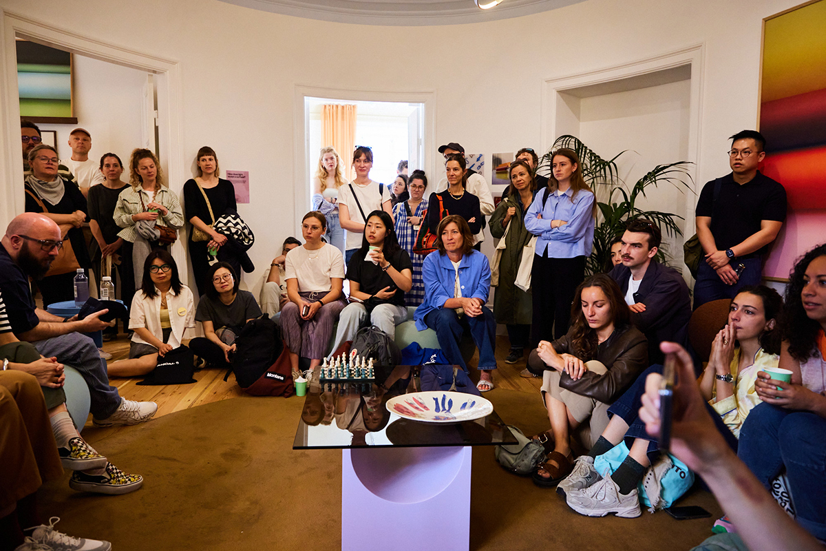

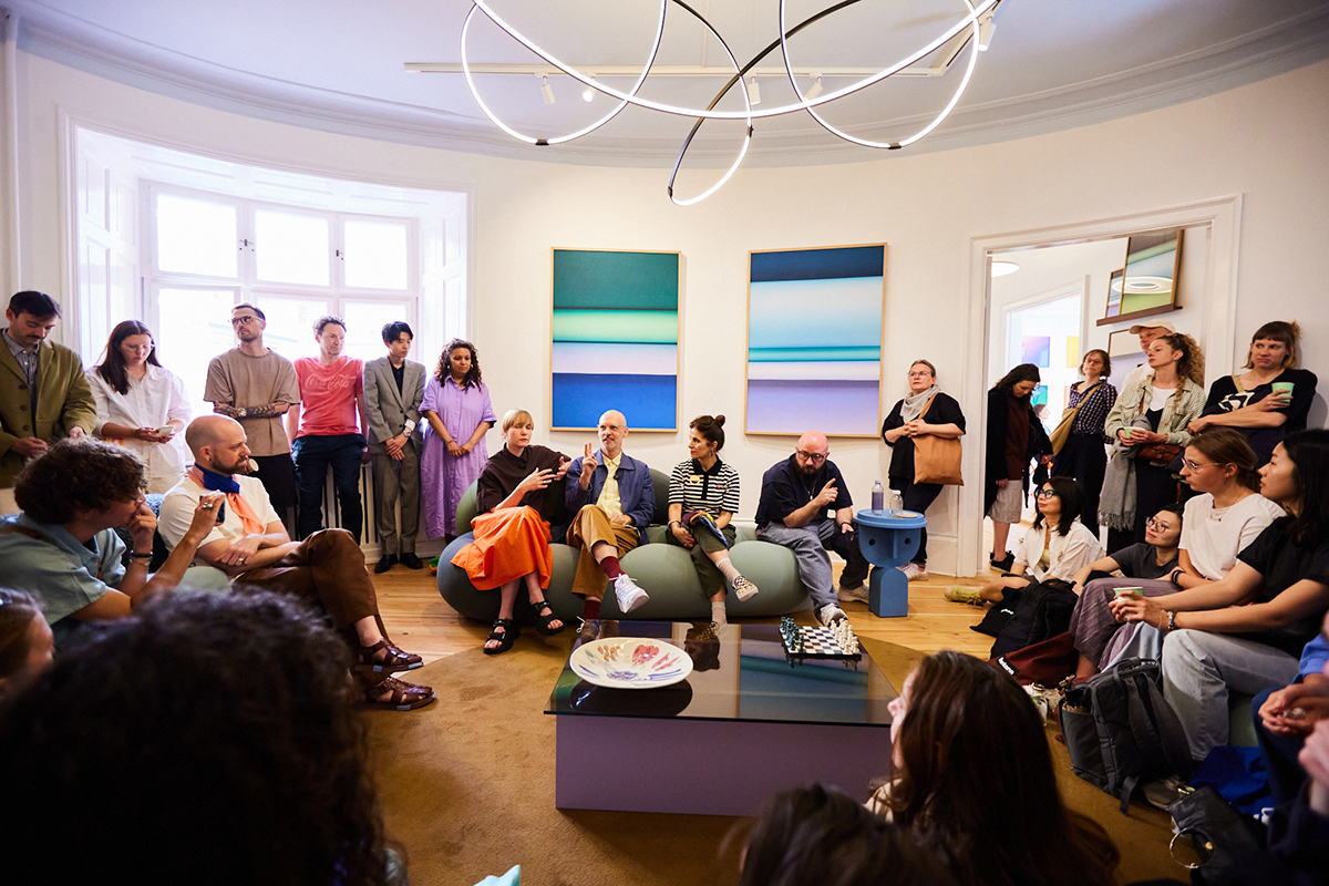
The talk left us inspired by their ability to connect colour, texture, and emotion through rigorous yet intuitive design. It was a reminder that projects can follow a playful process.
Images by Balder Skånström-Bo