Faces, Pion, Magnum and Link are examples of this.
Neotenic design inaugurates an era of soft, fun, playful and sometimes even naïve forms. Who doesn’t want to feel like a child again while being an adult?
We measure youth with figures and value it by the absence of signs of adulthood. Youth is not about slowing down time, it is about flowing with it in an optimistic mood. It is to understand life through active experiences; it is enjoying maturity by being curious and experimenting.
Furniture as well as architecture and interior design are disciplines that project spaces with people’s wellbeing in mind.
Neoteny is a scientific term used to describe “the retention of juvenile features”. Specifically, it refers to sweet facial expressions, big eyes and rounded cheeks that make you want to pinch others.
What about a neotenic design? In 2019, designer Justin Donnelly and architect Monling Lee introduced this concept in the “Neotenic Design” exhibition, curating industrial designs they admired for their inorganic shapes which have an exaggerated childlike quality.
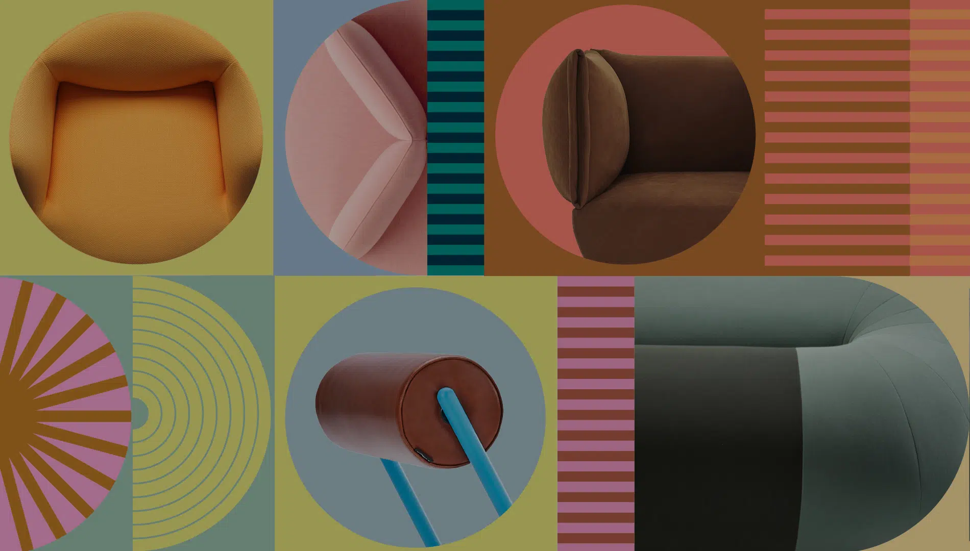
What are the main features in the furniture? Rounded forms, with exaggerated proportions which soften the rigorousness of contemporary objects. Whether with pieces that can symbolise animated characteristics or by disrupting the uses and materials of everyday objects. Neotenic design is characterised by curiosity, playfulness and experimentation. Faces, Pion, Magnum and Link are good examples of this.
Some of these proposals were conceived during the pandemic because we felt the need to develop products that transform the space. Cheerful products, sometimes transgressive and mischievous approach so typical of youth.
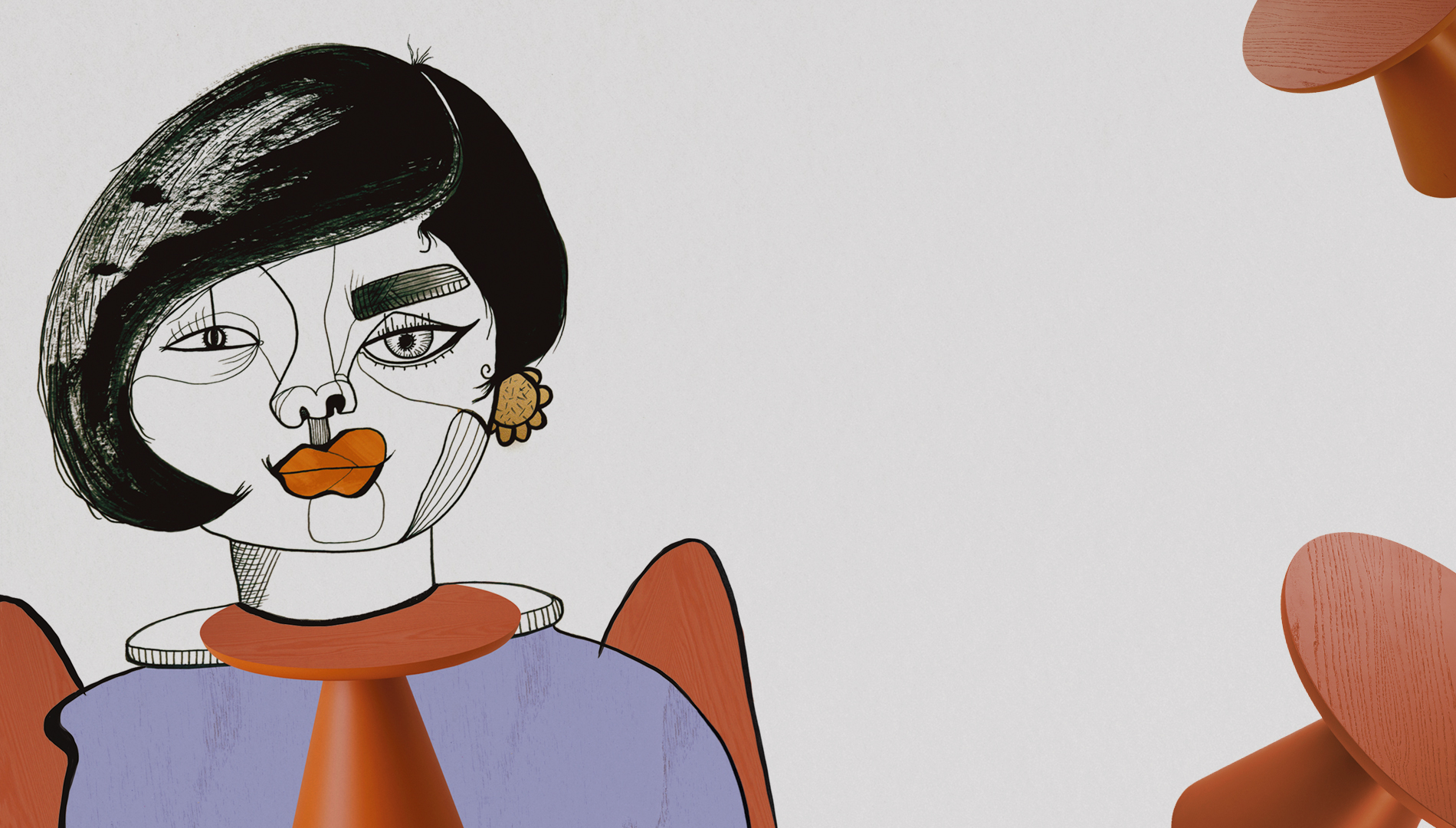
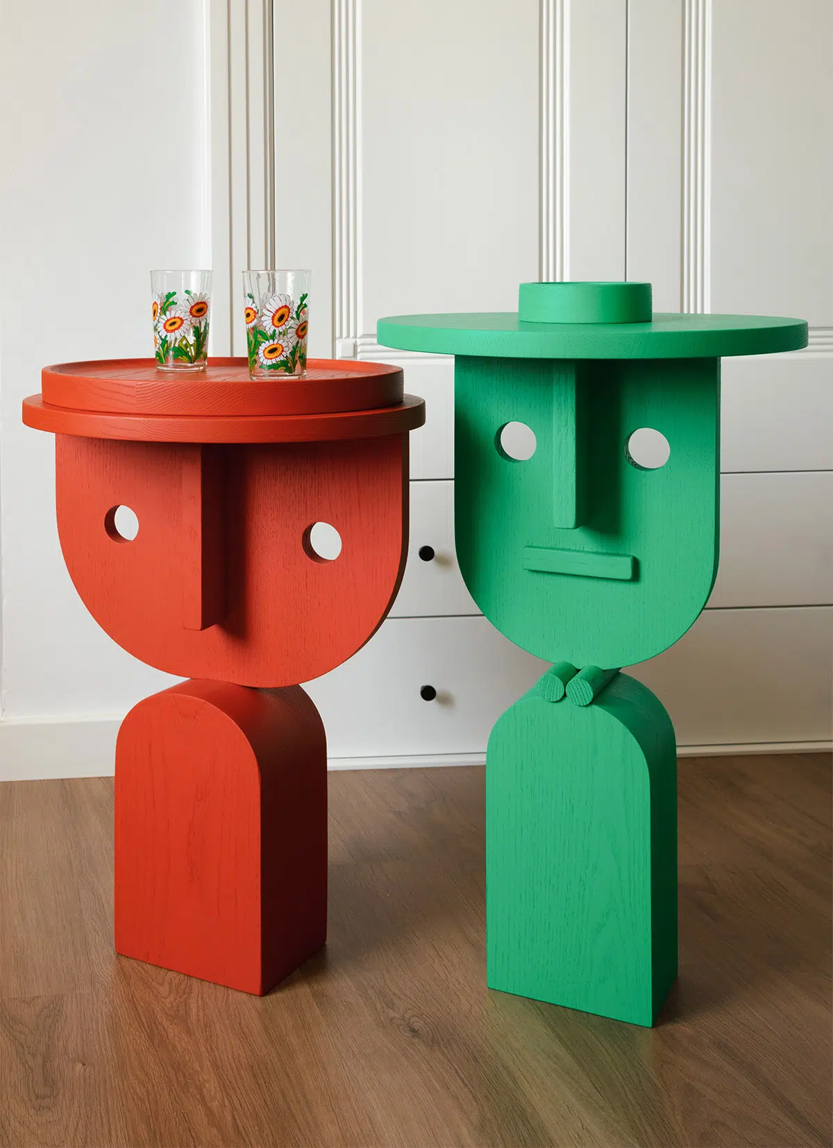
FACES. Nathan Yong wanted to show our faces again with this clearly anthropocentric design. Depending on the perspective, these busts are transformed into abstract figures. In both cases they serve as auxiliary furniture and celebrate creativity with no restrictions.
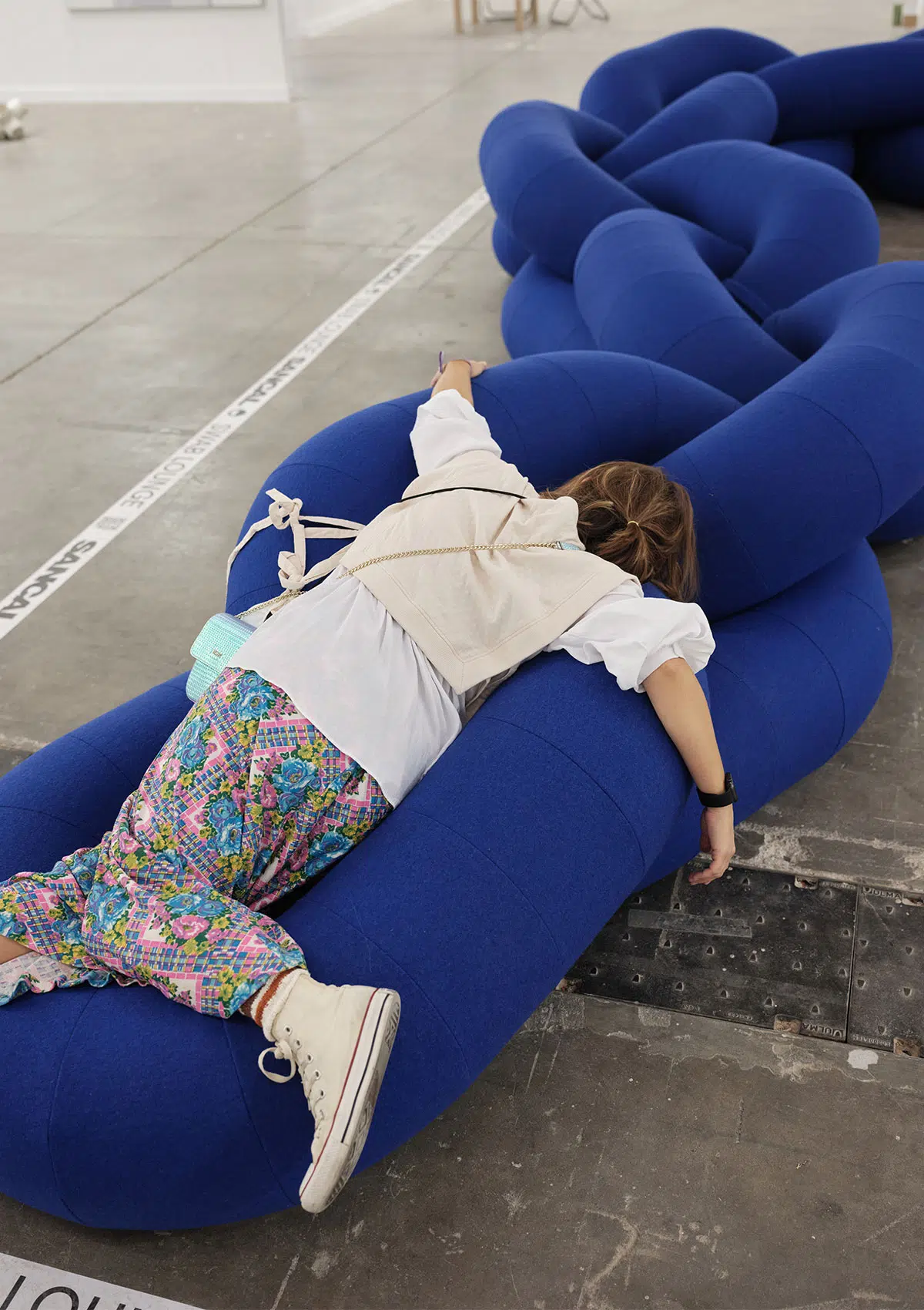
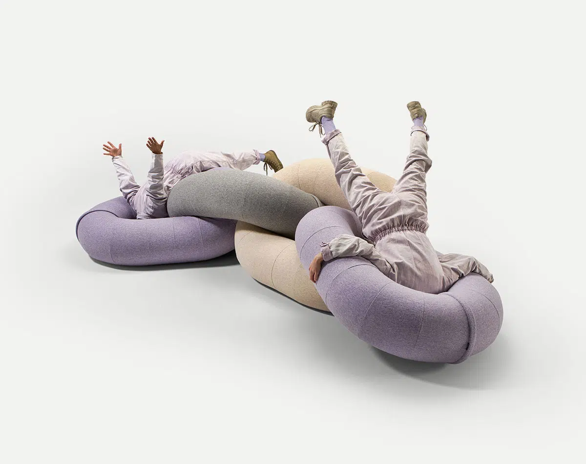
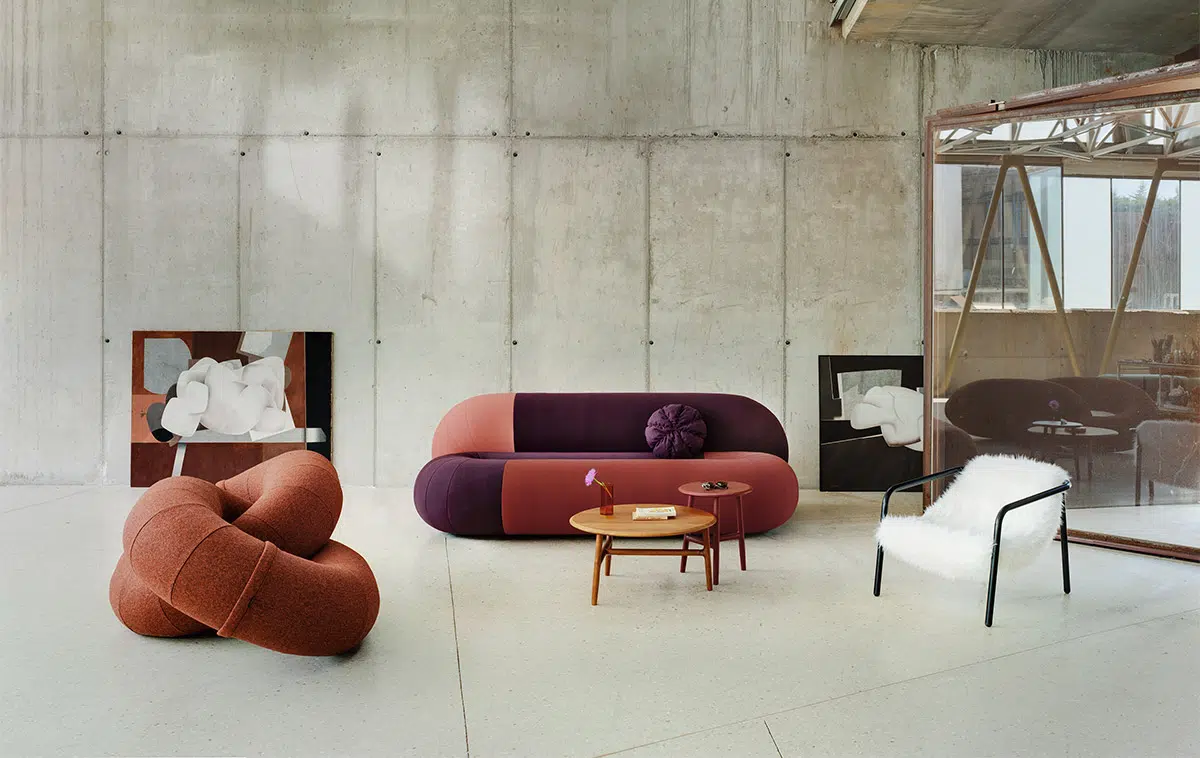
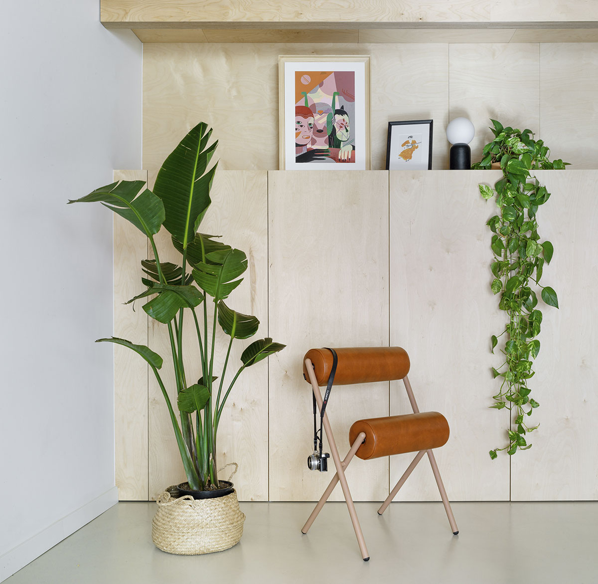
LINK and LOOP. Together with Raw Color we propose new ways of sitting. They also respond to that urgent need to socialise, so urgent not so long ago. Their curved silhouettes soften spaces and make them friendlier. Two proposals based on the cylinder as a formal element.
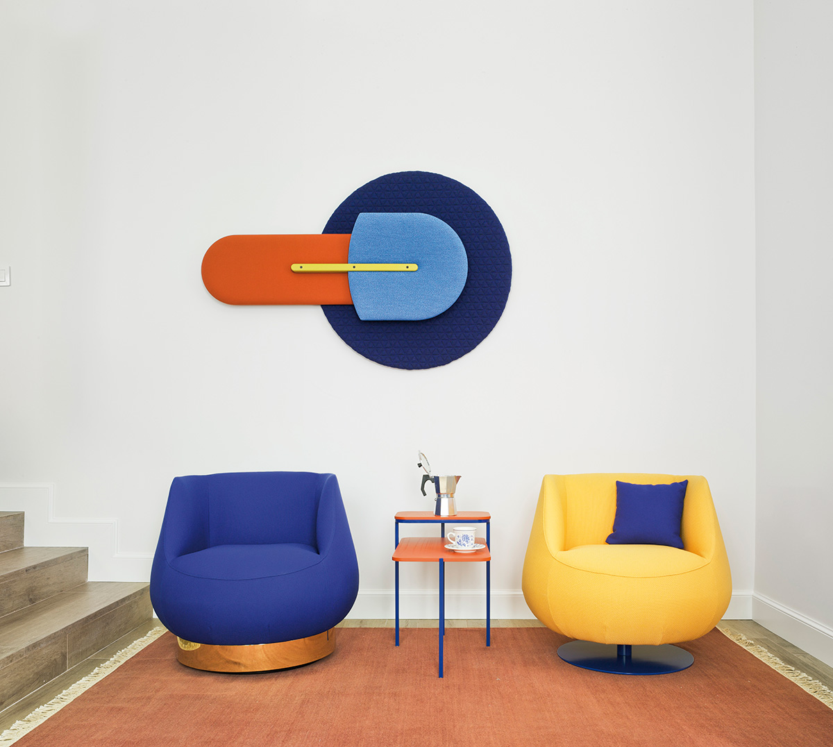
PION. A staple in our catalogue, this family of tables and stools is inspired by the forms of chess pieces. The scale of these pieces is enlarged to give life to pawns, kings and queens. The new colours for tops and bases give a more playful aesthetic.
MAGNUM. Jose Manuel Ferrero is a gentleman, but with Magnum he shows us his casual side. This seating family of seats is inspired by the shapes of cognac glasses.
ROLL. Mut adapts the leg-training machines that can be found in gyms into a guest chair. Ironic, isn’t it? Its silhouette moves away from archetypes to transform an everyday object into an arty one.
Also bordering on the artistic, these furniture pieces also interact beyond their original functions bring a small dose of happiness to spaces and people.