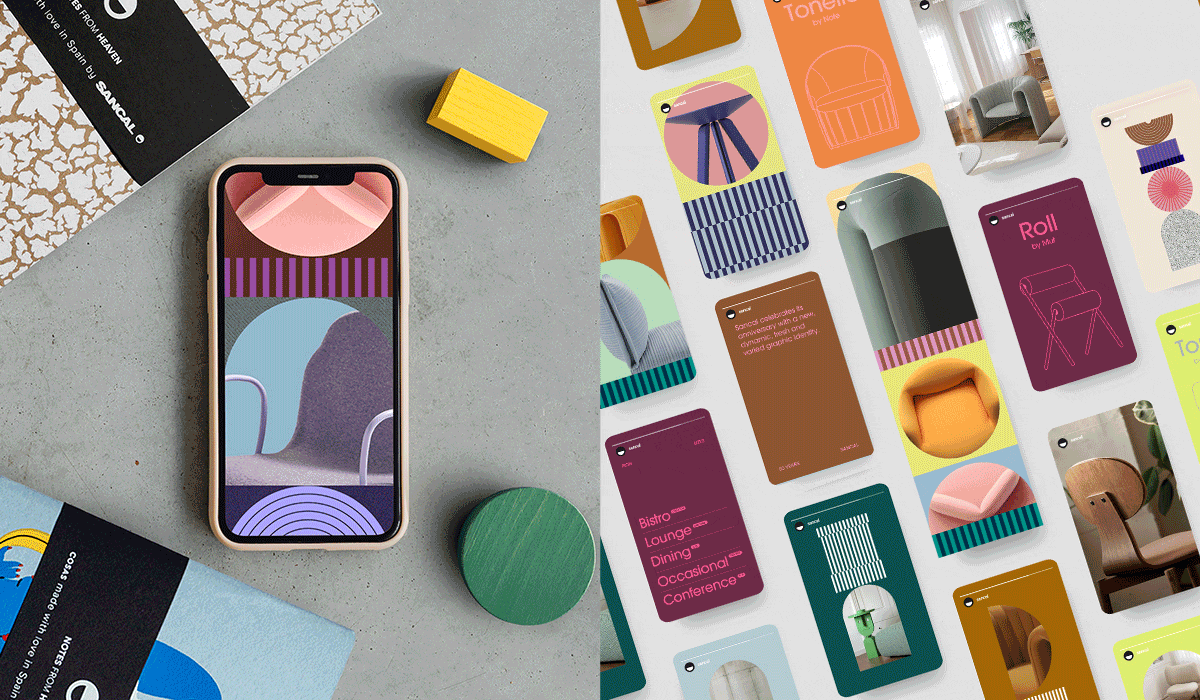
Sancal celebrates its anniversary with a new, dynamic, fresh and varied graphic identity.
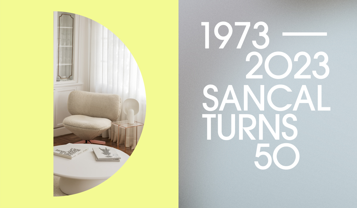
Adding days to the calendar instead of crossing them off! Stories, experiences, anecdotes and learning as well. This is how we understand turning 50… A long, intense journey, also passionate even though it has not always been easy. And in this maturity, we have reached, we also feel young, thrilled and committed. Because turning of the age is a really serious thing.
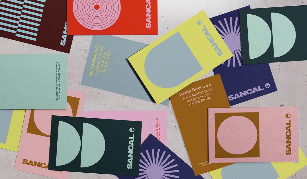
We have in mind many celebrations. Let’s start by sharing with you a new graphic code that will join our logo in the coming months. Dynamic, colourful and diverse. Because Sancal is the sum of many identities. Another way of enriching our day to day.
Estudio Sancal is, once again, in charge of the concept and design of this language. Juan Villaescusa, the team’s graphic designer, has worked hand by hand with Esther and Elena as guides in the process, because after all, they are the creative heart of Sancal.
Esther makes sure that everything goes the way it should. She looks for sense and coherence, while continuing to nurture creativity, passion and expertise. Elena brings colour even to black and white pair. And at her side, even silence has a soundtrack. Both complement each other with patience and also with their disparity of opinions. Together they trace a straight path full of curves.
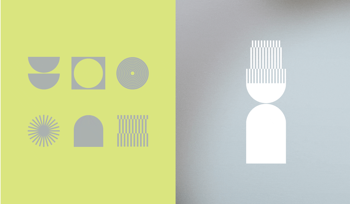
So, Juan started playing. The first thing we did was to groom Sancal symbol. The smiley face is dressed in a solemn 5, referring to the 5 decades of Sancal’s life. And why not twist and turn our smiley face into a serious figure of concentric circles or a dynamic and playful star?
Birthdays are a time to reflect. As we look back, we realize straight lines and curves have been with us since 1973.
Straight lines. They symbolize know-how, commitment. Them also refers to production processes and quality. The most rational part of Sancal.
Circles and curves. They symbolize our most extrovert, playful and transgressive side. Creativity and Design. Our constant desire to experiment and have fun with what we do.
Why just one symbol when we are many and very different?
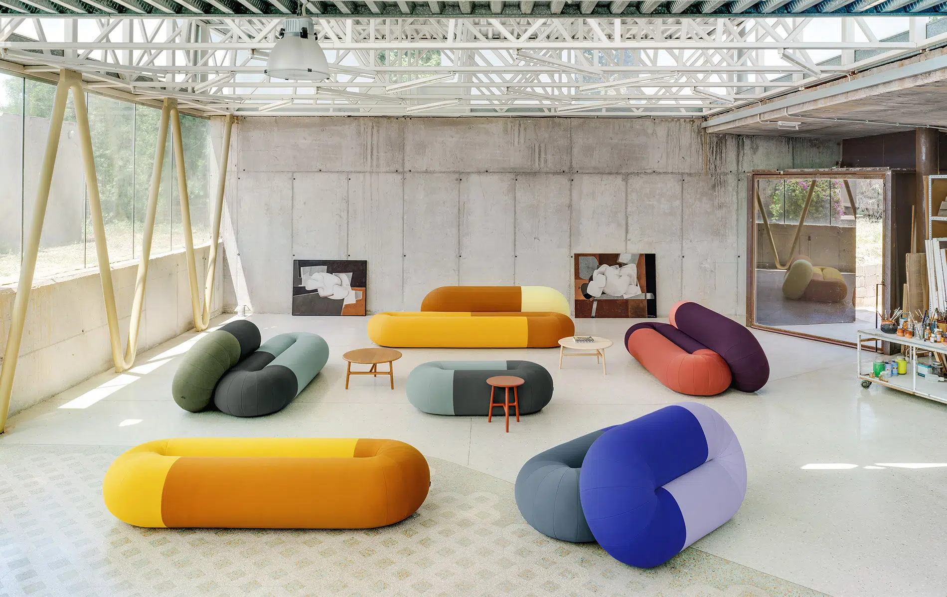
In addition, we have designed different compositions and figures based on the combination of circles, semi-circles and lines, which interact with each other by joining or intersecting… breaking the mold and creating new geometries and silhouettes. And when adding colour to these, the possibilities are endless. The new shapes transmit dynamism, calm, versatility, evolution and of course the stability that experience gives us.
That’s how we state our team. Multidisciplinary. We are a family. Also, that our partners are part of it and their designs are also diverse and colourful. Being different does not make us unique, but it does make us authentic.
Where will you be able to see it?
This new graphic language will be applied in different stationery and digital media. We will be handing our new business cards shortly. Our IG profile and other channels will also be updated with this fun graphic code. And little by little you will discover other applications.
A very 70s typeface.
The curved geometry of the Avant Garde typeface, so popular in 1970s advertising design, is the one we have chosen to accompany all the graphic material we have developed. Its basic shapes, defined by sharp curves and sharp lines, reinforce the new graphic code.
This typeface family was first seen in the Avant Garde magazine logo, hence its name. Herb Lubalin designed the logo and Tom Carnasse defined the entire alphabet.
Thanks for blowing out the candles with us!
When…? Stay tuned!