Come and see it!
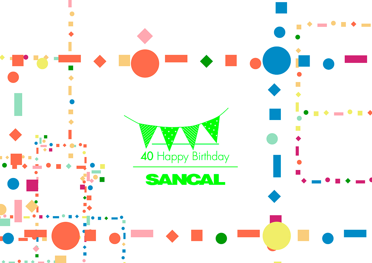
When we thought about celebrating Sancal’s 40th birthday, the first idea come to mind was that of having a great party. But, as we usually do with all our ideas, we let it rest for several days. Once it woke up, we realised that a party is quite a frivolous and unimaginative event, as well as so fleeting that its memory would fade away in the blink of an eye.
This is why we reconsidered how to celebrate such an anniversary. We suddenly thought of the people who are beyond their 40s and decide to make some “touch-ups”. Although this isn’t our philosophy, since we appreciate the signs of the passage of time, it seemed much more stimulating to us to operate on our “mature” facilities because, at the end of the day, they shelter more than 70 people who see how our products are born and grow older.
From that moment on, our purpose has been to create an inspiring tour with the main goal of transmitting the visitor that design and art play a key role in our company. Murals, design spots, corridors, signage and our newly restyled dining-rooms liven up workdays and, at the same time, our philosophy bathes our products and staff.
After 5 hardworking months, we are now ready to share the result with you. We are already enjoying it at Sancal so it’s about time you enjoy it too.
Signage:
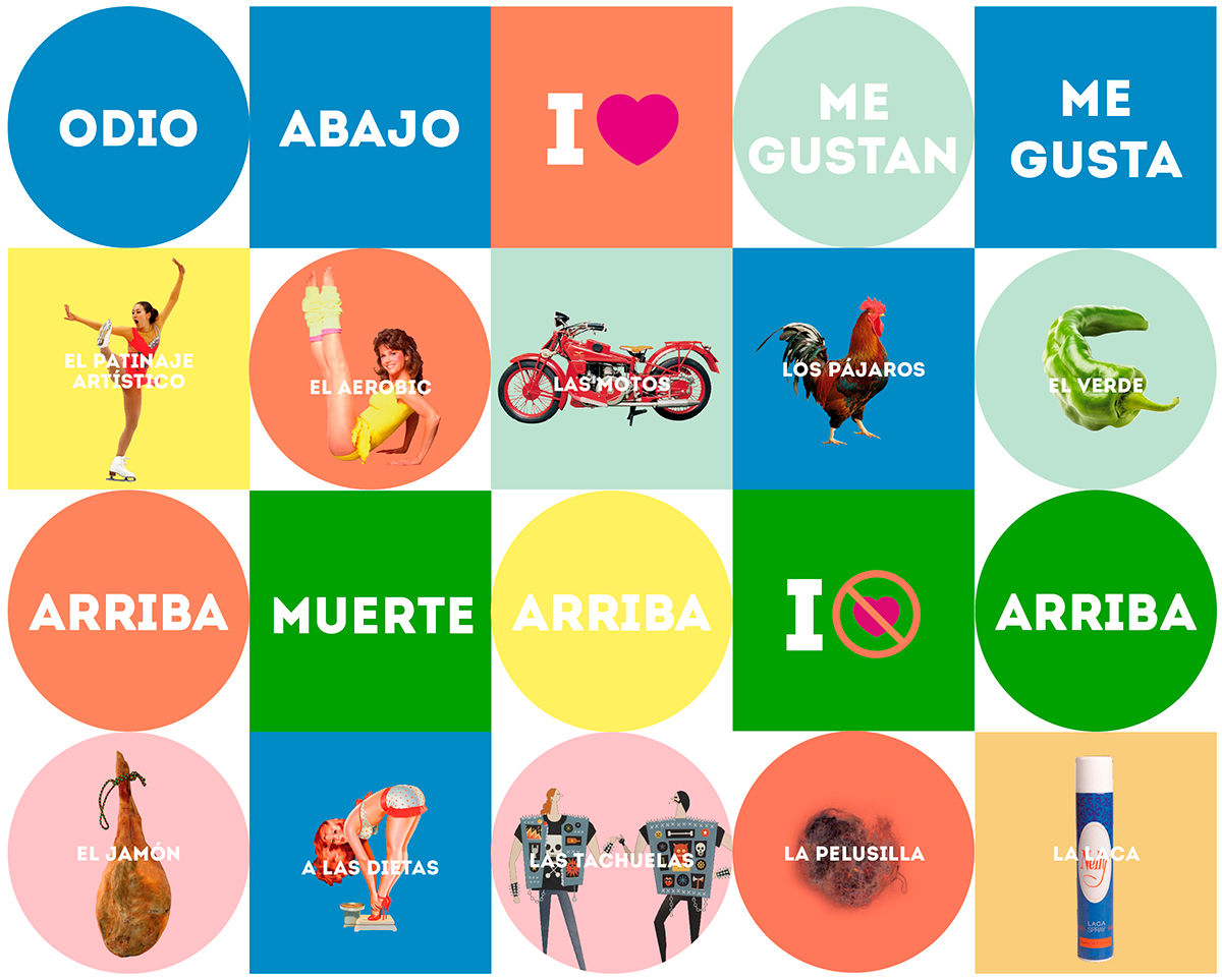
Apart from murals, which without any doubt both liven and light up the production sections, it seemed necessary to draw a suggestive itinerary to get the most out of the tour. This is how the need of redefining and re-marking the corridors was born. To that end, we designed a colourful geometric pattern in which the colour gaining relevance points out the section where we are. A white 10 centimetre-width tape draws the corridor perimetre in which rhombus, circles, squares and rectangles roam freely in a deliberate anarchy. Red, yellow and blue are pure and deep colours that mix together with pastel shades, balancing our moods.
The idea of an alternative itinerary is emphasised at the ceiling thanks to some hanging mobiles created ad-hoc, using circles and squares in the colour of each section. Another ingredient helps us put the cap on these graphs and their message: Serrano ham or la siesta are some traditional concepts that intermingle with more modern ones, as Dracula or tofu, and even with more surreal notions, as chicken breast or vaseline.
The signs are a satiric take on the strange contrast between calendars featuring religious icons or erotica found in workshops this side of the Mediterranean. With this purpose we’ve created a union between cult and popular images, keeping some old favourites like motorbikes, pop stars or sensual women, and contrasting them against contemporary references.
In conclusion, the colourful signs meet two purposes: They remind us of where we are and reflect our interests. We flip from one extreme to another; after all, our Latin character is somewhat impulsive and spontaneous.

Design Spots:

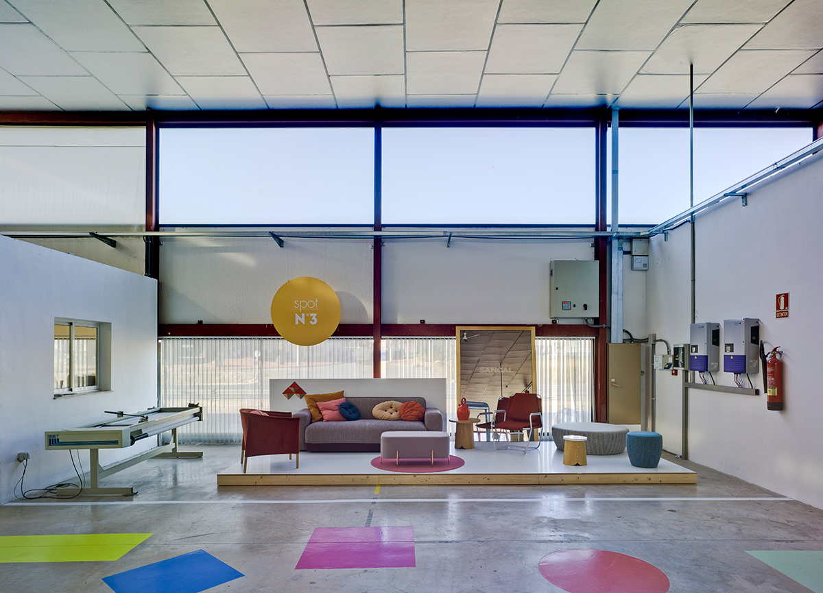
The brainstorming process brought us the crazy and practical proposal of showing our products in their natural environment, this providing an additional meaning to them. We’ve accomplished this with the use of four micro-showrooms; the visitor will find our latest designs presented within the factory itself and willwitness the production process too.
Each of these micro-showrooms is located in a different production section, so it is as easy as possible for the visitor to learn about how production works. The platforms where the products are exhibited are in totally white to help the visitor detach from the industrial environment around them. As it can be seen, the setting is quite simple but with small touches that make the product stand out against its surrounding.


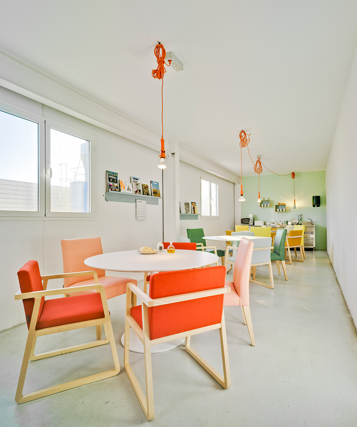
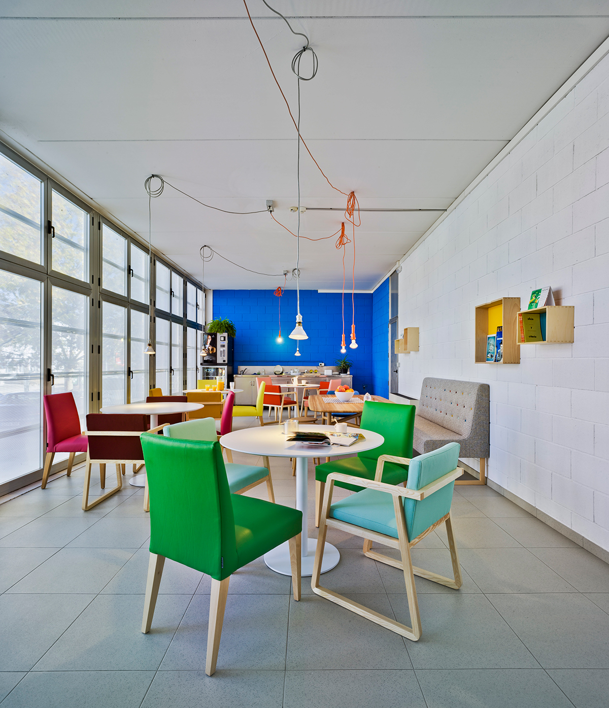
Dining Room:
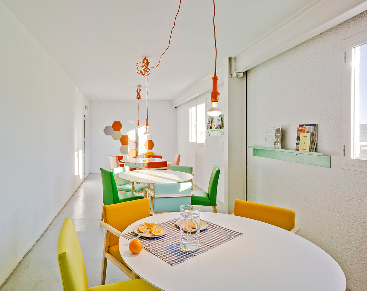
To top of the celebration, the dining-rooms turn into another micro-showroom, presenting the product in a real situation. We let the colourful corridors and hanging sings conquer the space and change the previous cold dull environment of a rest area into an inspirational place.