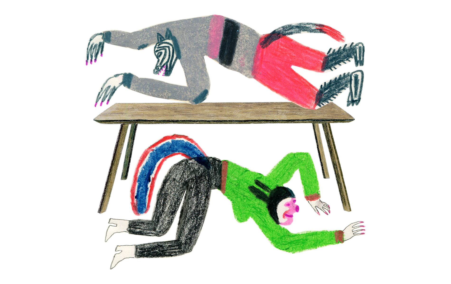
True messages
Lettering is one of the creative disciplines which we value in Sancal. Not only because of the art of drawing letters, but also because of the meaning of words and expressions which transmit to anyone who reads them. We have counted on Marial_Soy, an artist and friend of the firm.
Her intervention in Sancal’s blank walls is not only a creative work, but also experimental and enjoyable. The main purpose of the illustrated messages is to make smile our workers and anyone who visits us or simply evoke old memories during a tour around our facilities.
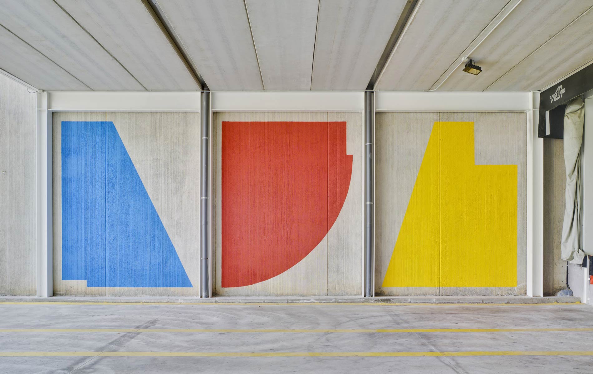
These messages, together with the outer graphical elements, contribute to decorate our new installations in a different way, less figurative than the previous ones, which were previously done in the rest of buildings.
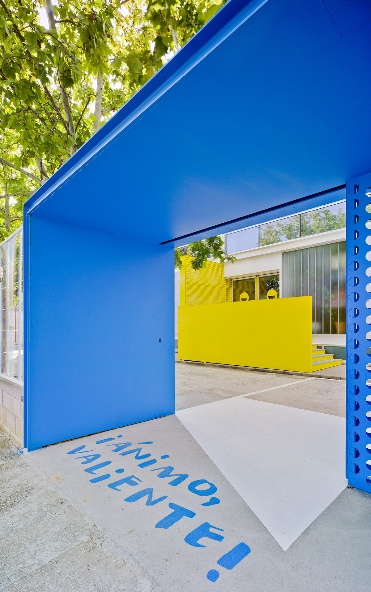
Words in our local and particular way of speaking here in Yecla, together with deep reflections and romantic choruses which all of us have hummed sometime, mythical expressions from fantasy films or encouraging messages make up the statements, which can be read once you cross the threshold.
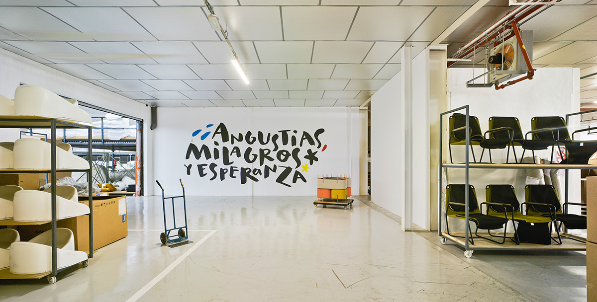
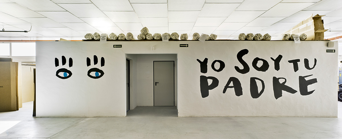
They are actually something like mottos of what happens every day at Sancal, specially the great “Angustias, Milagros y Esperanza” (“Anguish, Miracles and Hope”), which is the closest thing to our Holy Trinity, or the classic “Yo soy tu padre” (“I am your father”), which reminds the fact that we are a family company.
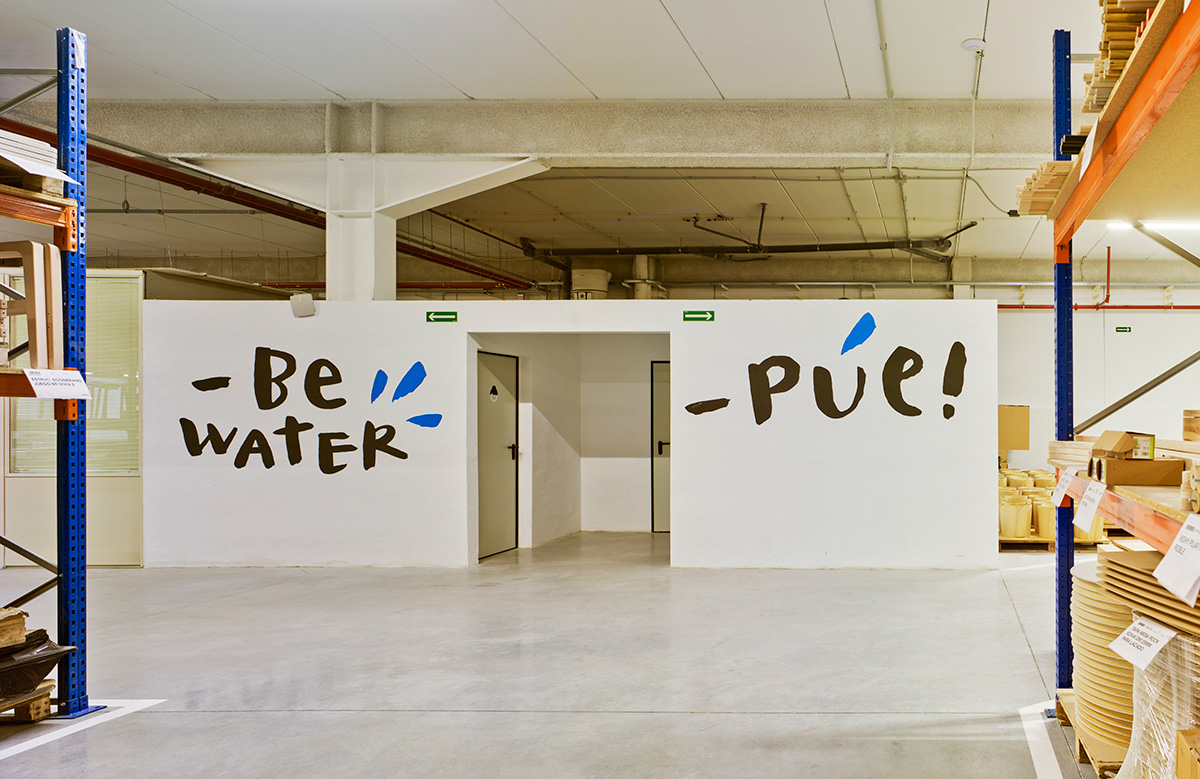
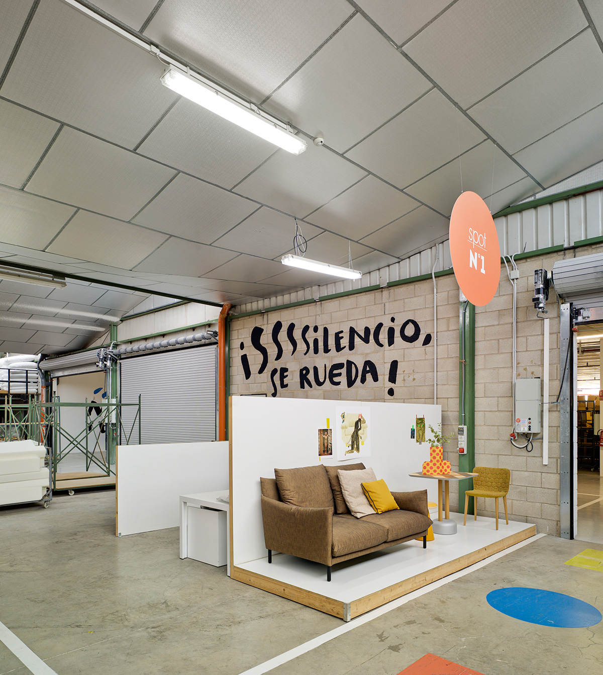
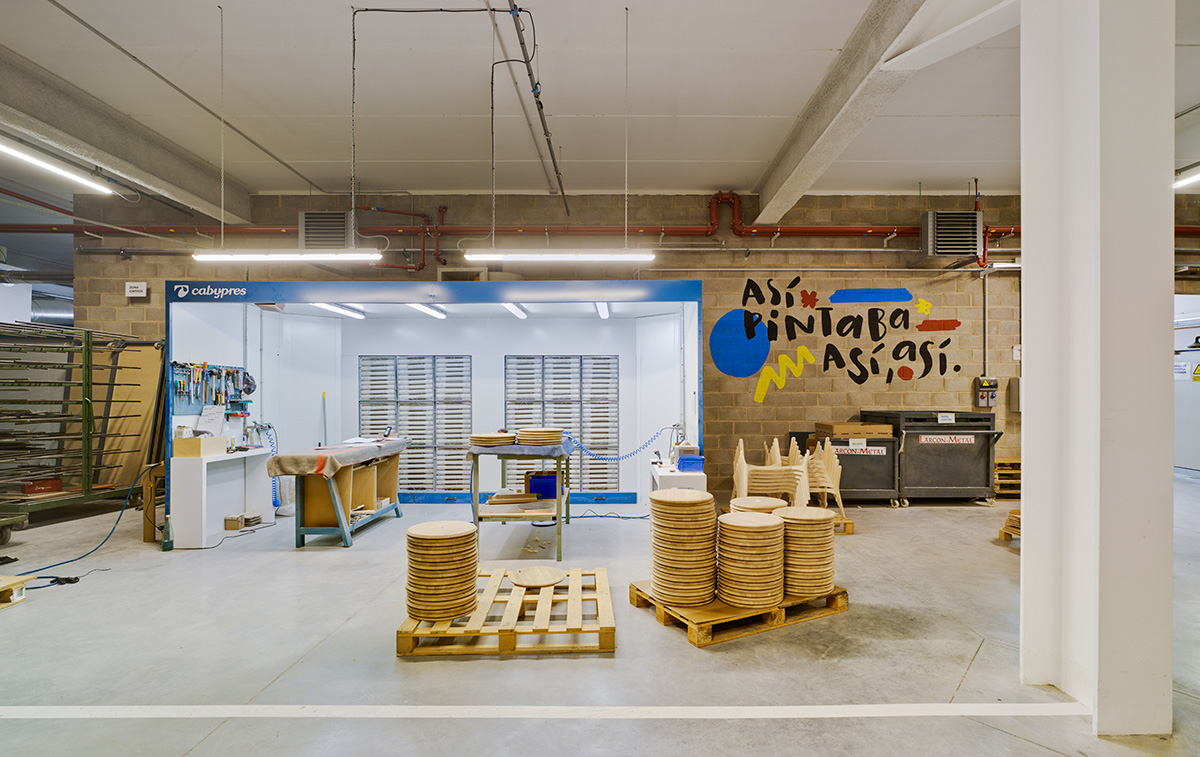
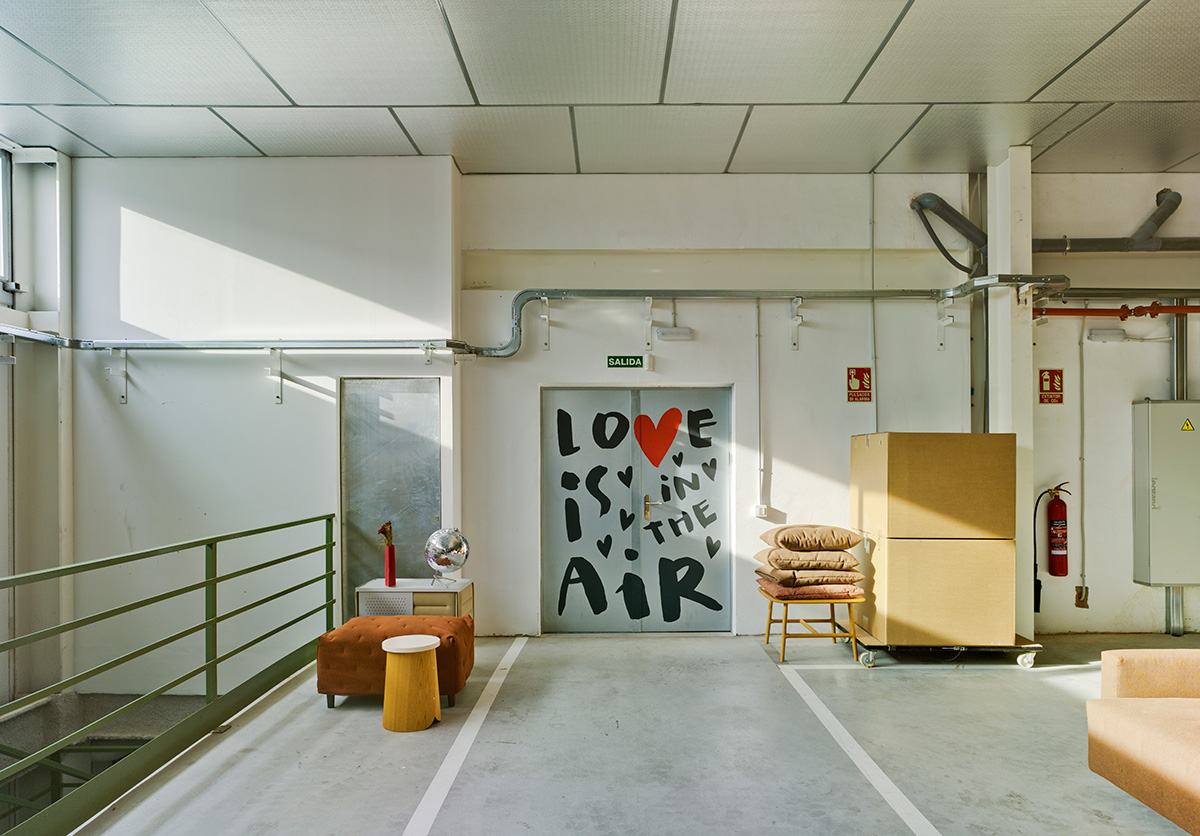
With regards to the meaning of the rest, it should be said that “Be water – Púe” represents our local character in a funny way, as our horizon is far beyond our borders, but we preserve our local essence. “Silencio, se rueda” (”Silence, we are filming” from a Spanish TV series from the 60’s) has to do with being focused and disciplined while working. “¡Ánimo, Valiente!” (“Be brave!”) encourage us to start new projects and “Así, pintaba, así, así” (from the chorus of a popular children’s song “That’s how they painted…”) reflects our joy at work and our passion for colour. As for “Love is in the air” crowning our showroom, it expresses that there’s a bit of our heart in each of our products and that’s why they exhale LOVE.
A sincere work, since according to Marial_Soy “if the message is empty, I rather say nothing”.
The gestation of this work hasn’t been improvised at all, as it brings a previous work of conception of messages and sketches, as well as a study of the spaces. Once the work has been defined, it’s time to get the hands dirty to measure the traces on the walls and different canvas. With no doubt, it creates a pleasant visual impact, which don’t let miss the readability of its words.
Pure black is the colour which makes our artist feel most comfortable to develop her work. However, she has added some points of colour in this collaboration with Sancal: yellow, blue and red, which harmonize with the architectural elements in the building.

MARIAL_SOY
She’s a graphic designer, illustrator and above all, a dreamer and cheerful person. This artist, meticulous and curious, accepts all those challenges in which she can put into practice different techniques and reinvent herself. Lettering is one of the disciplines which she has been recently using for her projects, connecting her passion for lettering, the meaning of the message and handmade things. She’s addicted to Indian ink and pure black. For the murals she has done for Sancal, she has also used red, yellow and blue, as a point of colour which contrasts with the white backgrounds and black traces.
Photos by David Frutos