How to use it in your interior design project
Blue, or “Classic Blue” to be exact, has been chosen as colour of the year by the Pantone Colour Institute.
In this article we look at how to use blue colour palettes in a variety of interiors featuring our products for our General Catalogue.
For Sancal, the interior design in which the blue range predominates can be elegant and sober, without being boring. Combining blue decorative elements, like sofa fabrics, wall art, acoustics and chairs with other colours can enrich your interior design projects.
What does blue represent?
Apart from being undeniably elegant and honest, blue transmits a sensation of calm, confidence and stability. It is also incredibly versatile, although often overlooked in modern interiors and architecture.
How to combine colours
Sancal is from the Mediterranean, so the moment we think of combining blue, white and off-whites spring to mind. Picture dark blue rooftops and white–washed walls.
Brown or beige naturally fits well, but you should also consider brick–red or even a touch of yellow or gold.
Airy Living Rooms
Mediterranean colours are very present at this living room.
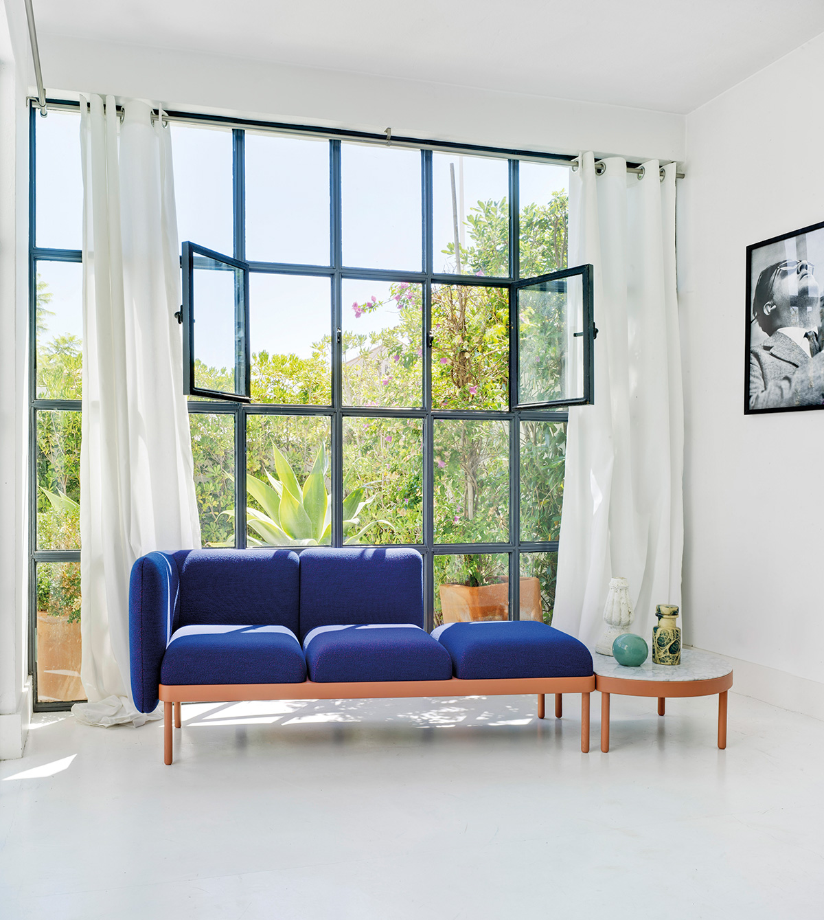
This colour combination is illustrated in the living room pictured above. White walls, curtains and flooring combines with the marble table–top.
The petite Mosaico sofa and table are by Spanish design duo Yonoh. Its dark Royal blue upholstery and brick-red wooden structure bring them to the fore.
Kitchens that make a statement
Kitchens have encroached on our living spaces, and so their prominence have grown.
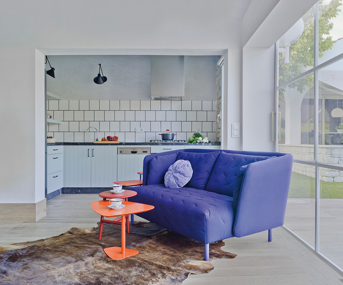
Rafa García’s Obi sofa featured here mixes dark Klein blue with light blue accents by Mandarina scatter cushion. These tonalities are echoed in the blue tile grouting and work surfaces.
Rock tables, by the same designer, add brick red to the mix but these vivid colours are calmed by a beige floor and off-white walls.
Halls as a focal point
Yellow adds a twist to the colour code that we have been outlining so far.
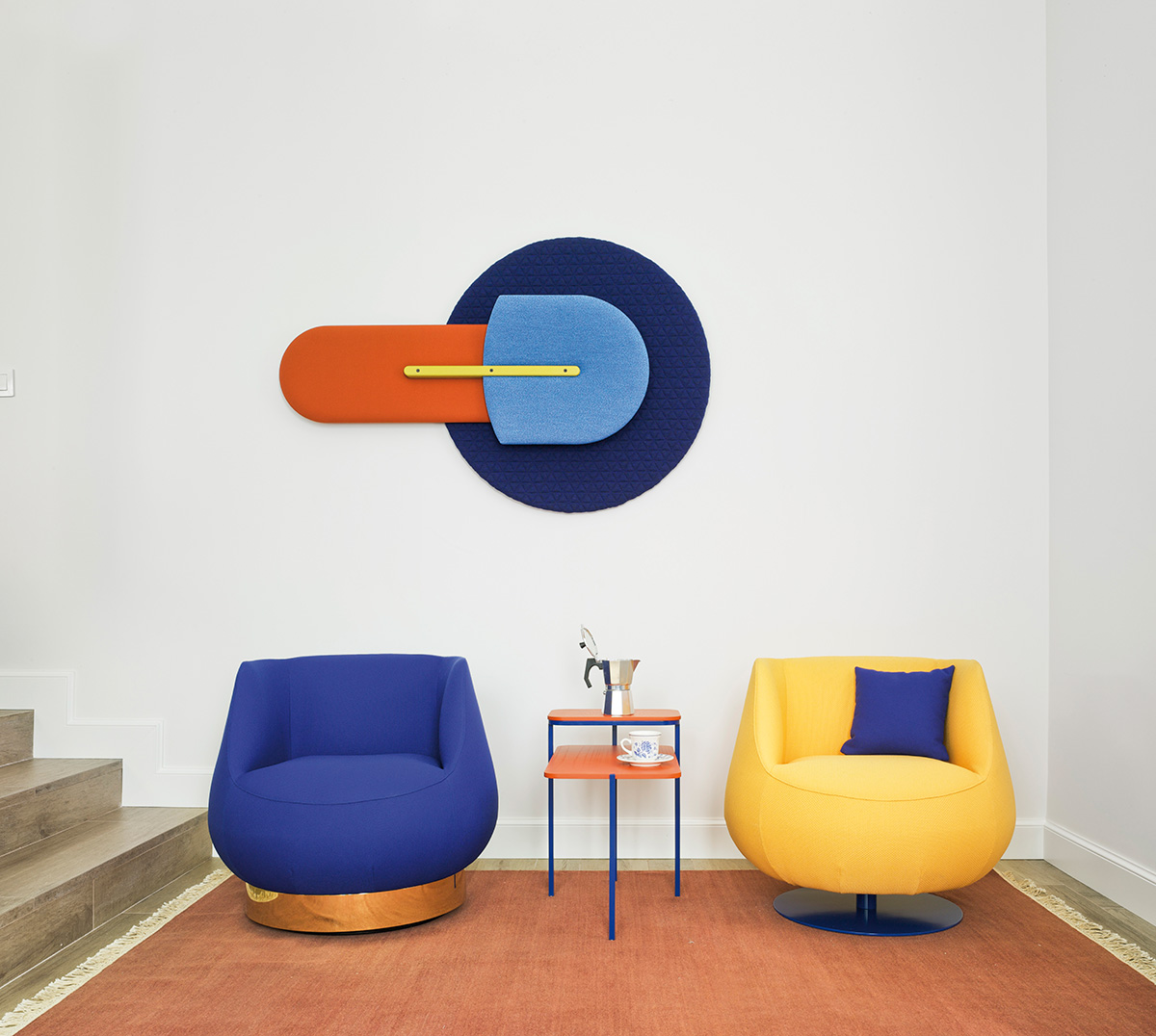
The wall art is an acoustic panel by MUT Design called the Beetle. Here we can see the full effect of brick-red, yellow with light and dark blue set on a white wall.
The Duplex table, by the same designers, mirrors the selection of colours. As do the Magnum lounge chairs by estudi{H}ac, adding a gold plinth to the composition.
Inspiring offices
Our Mediterranean look works for us at home or in the office.
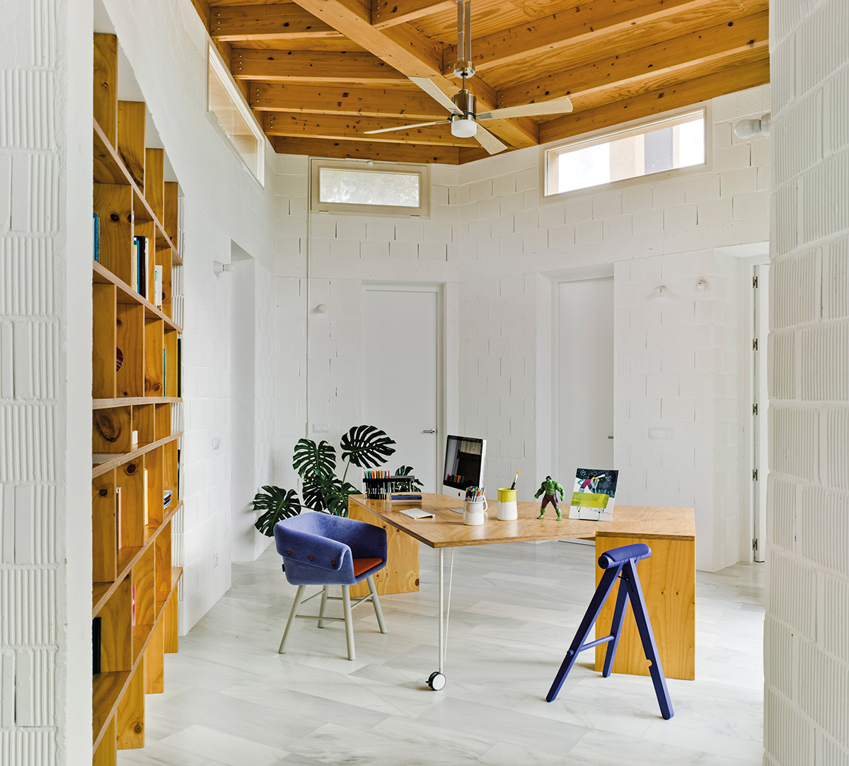
Here, brown surfaces provide a link between the pure white surrounds and the dark blue upholstery.
The Perigallo stool is stained blue to match the seat, however, Skrivo’s Collar chair has been combined with a red seat and off-white legs.
And so, to bed
As we bring our review to a close we turn to the bedroom.
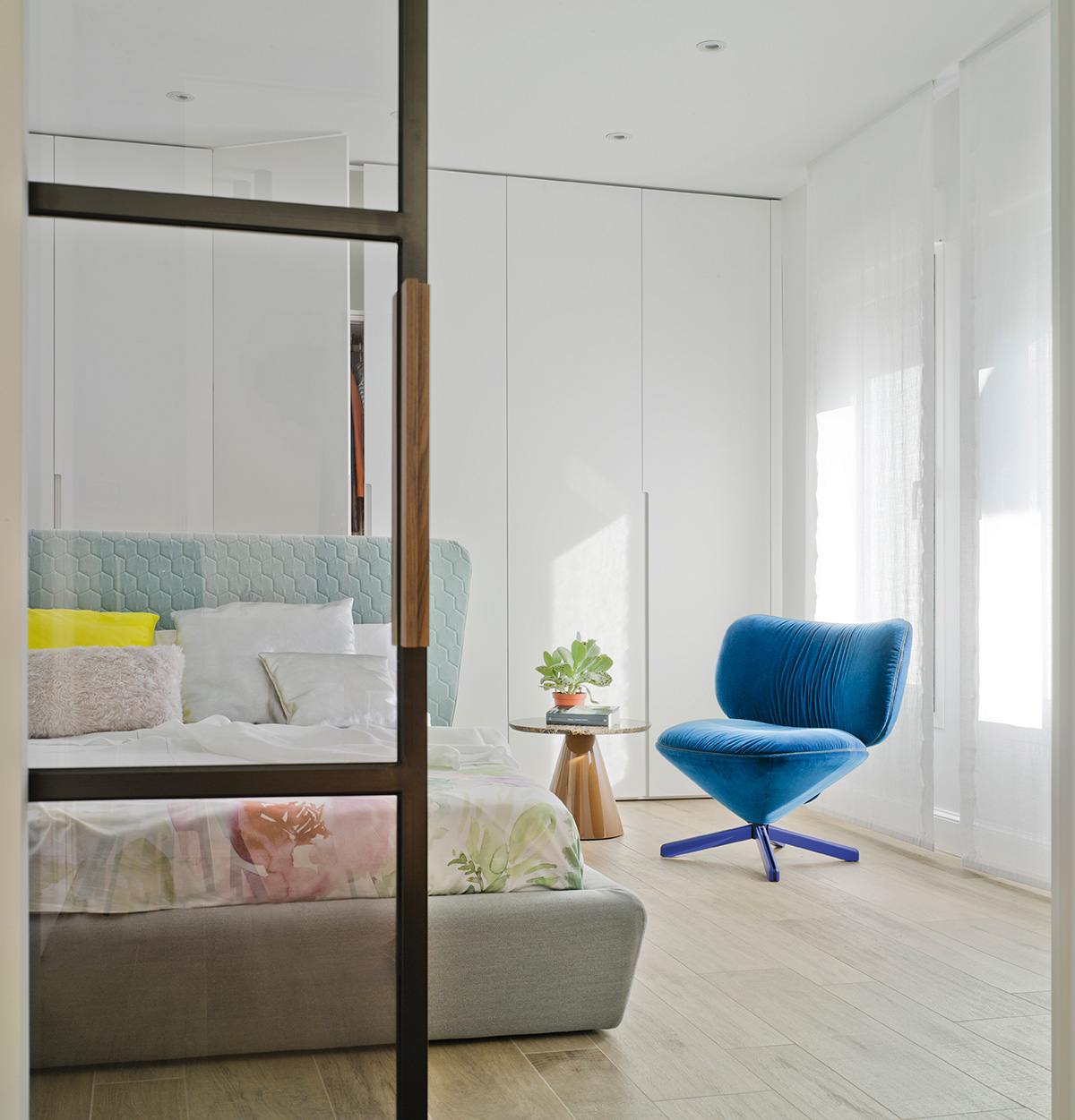
Just as our colour palette is light and joyful during the day, so it creates a clean and uncluttered mind for resting.
Our bedroom features a brown Pion table by Ionna Vautrin and a blue Tortuga lounge chair. Spot the touch of yellow hidden amongst the other scatter cushions.
Where to go from here?
Simply visit the web page for each of the products featured by following the links in the article to download free 3d images of products or go wild in our download section.
If you want more ideas from Sancal, sign up for our monthly review here: